Shankara – eCommerce Redesign for Yoga & Wellness Retailer
Shankara – eCommerce Redesign for Yoga & Wellness Retailer
Role: UX/UI Designer
Client: Shankara.it (Italy)
Platform: Web (Responsive)
Year: 2020
Overview
Shankara.it one of the leading Italian eCommerce platform offering yoga, fitness, and wellness products to a broad community of conscious consumers. The original website had strong brand recognition but suffered from dated visual design, low conversion rates, and a cluttered mobile experience. The goal was to modernize the brand’s digital presence and optimize the end-to-end shopping journey for both desktop and mobile users.
Challenges
- Dated visual design and low visual hierarchy across product and homepage templates
- Inefficient navigation structure with too many competing CTAs
- High bounce rate on product listing and detail pages
- Unclear brand tone on mobile—visual inconsistency and lack of storytelling
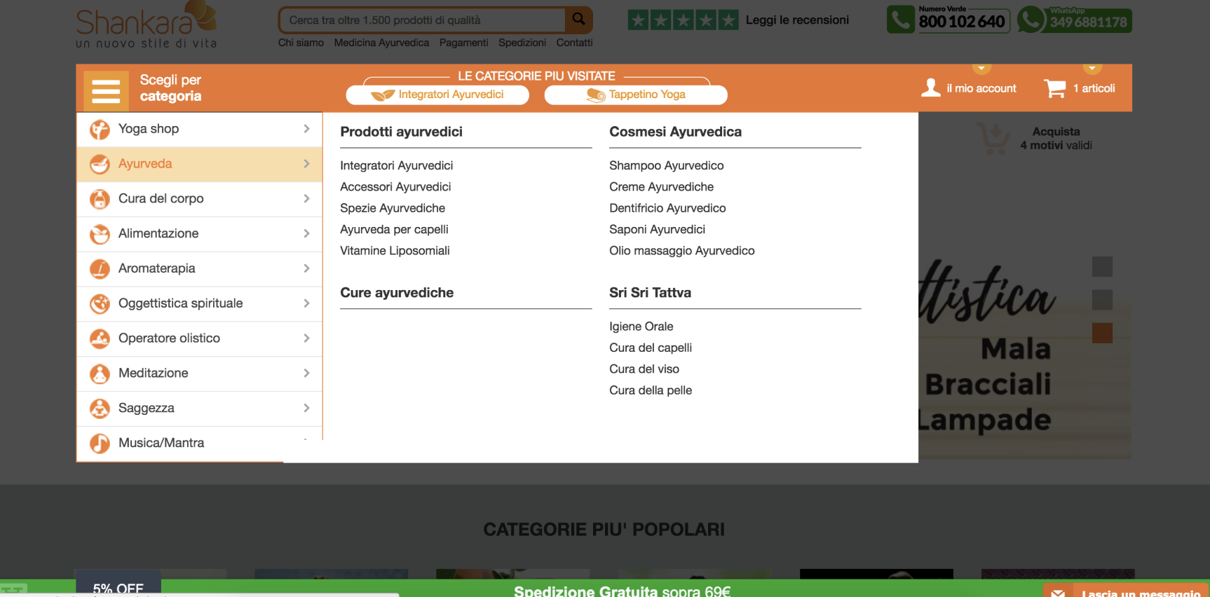
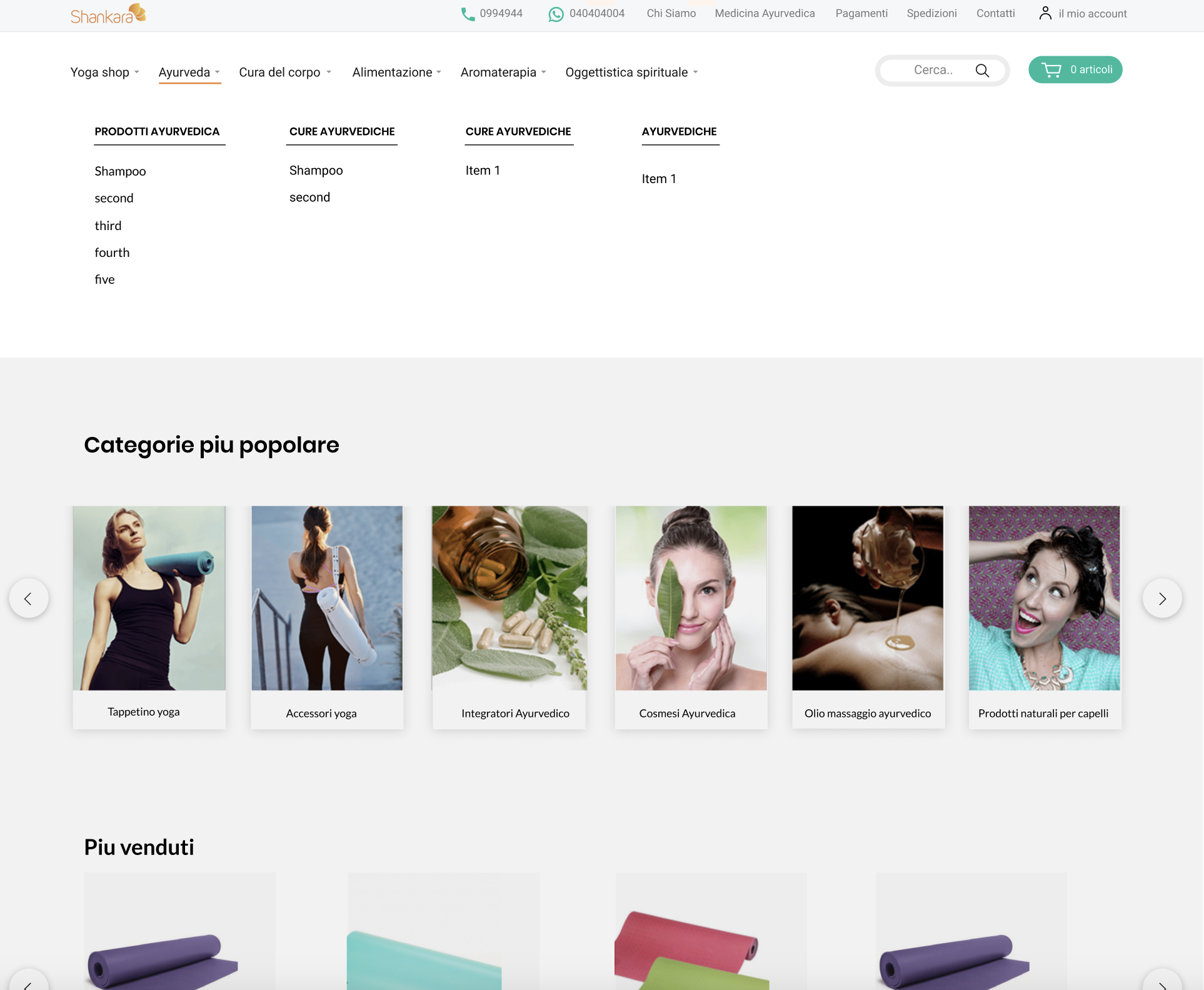
Old Pages Before The Redesign
Before the redesign, the Shankara.it eCommerce pages suffered from significant usability and visual design issues. The layouts were cluttered with competing elements, lacking a clear visual hierarchy to guide users toward key actions. Product information was scattered and inconsistently formatted, making it difficult for customers to quickly assess items or proceed to checkout. The color palette, typography, and imagery felt outdated and did not reflect the brand’s premium yoga and wellness positioning. Overall, the interface lacked focus, cohesion, and modern design standards—resulting in a disjointed shopping experience that hindered product discoverability and user engagement.
Existing visually and UX outdated layouts


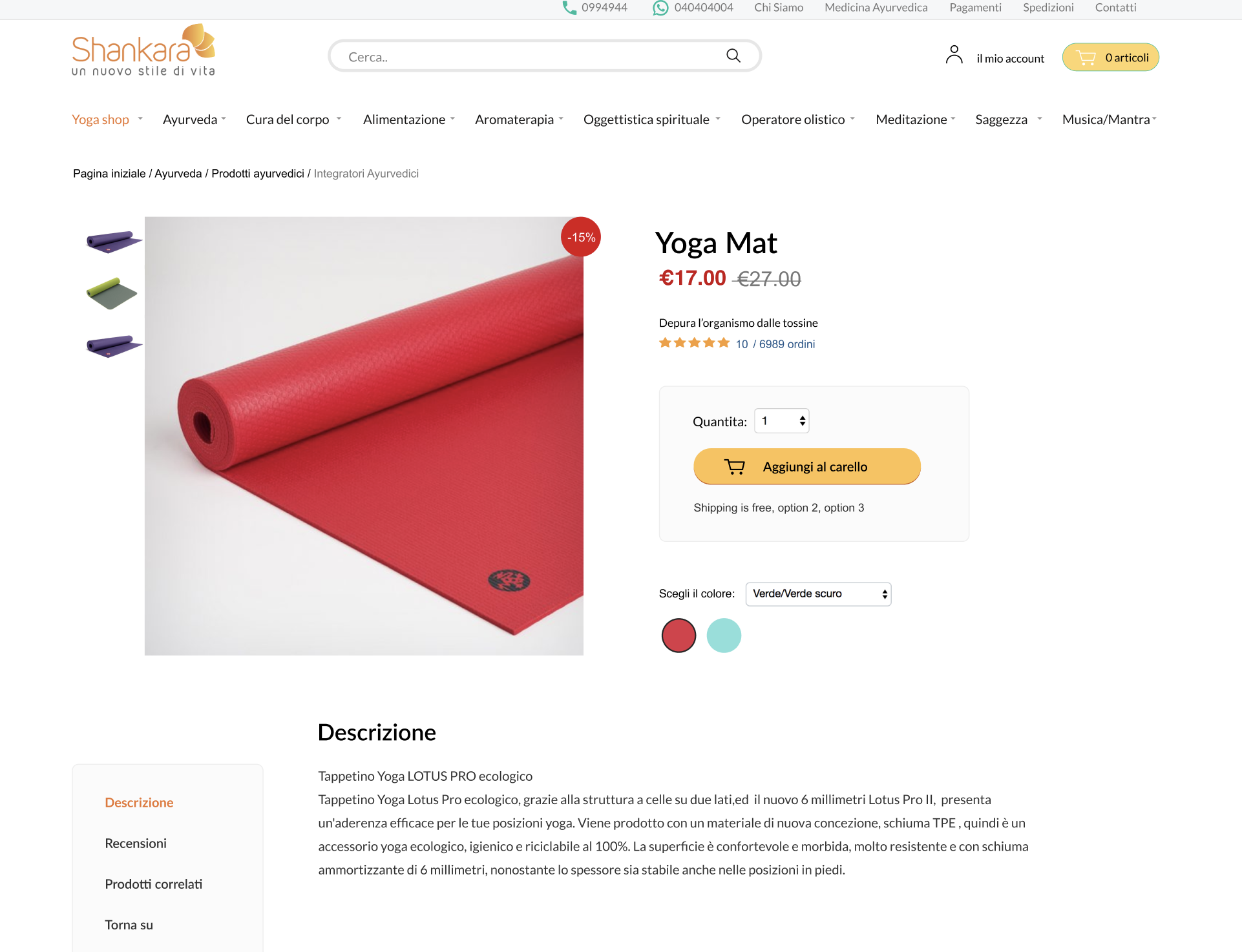
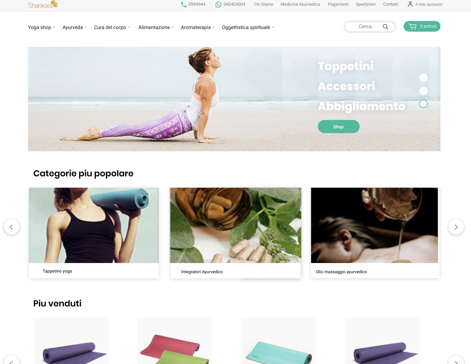
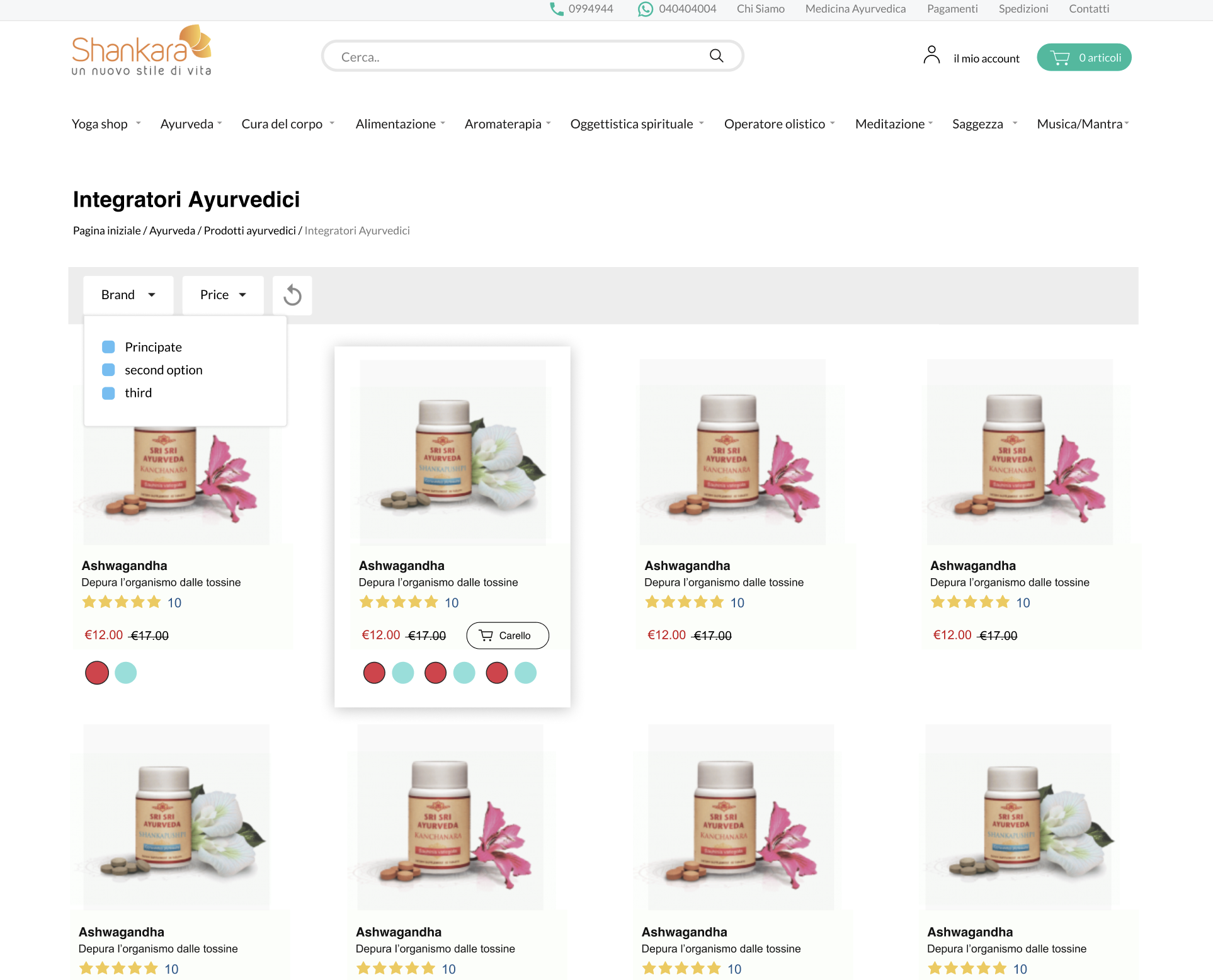
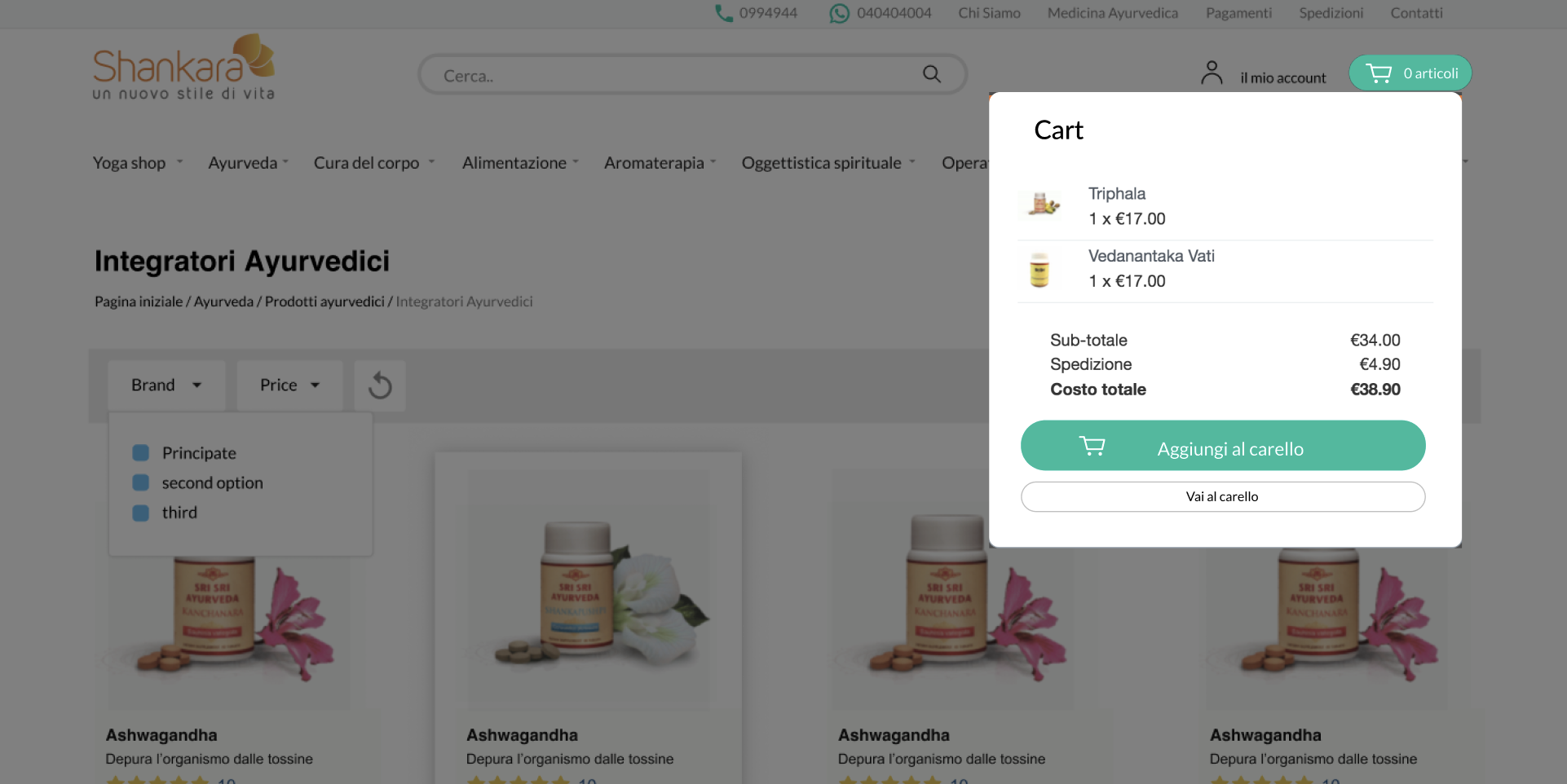
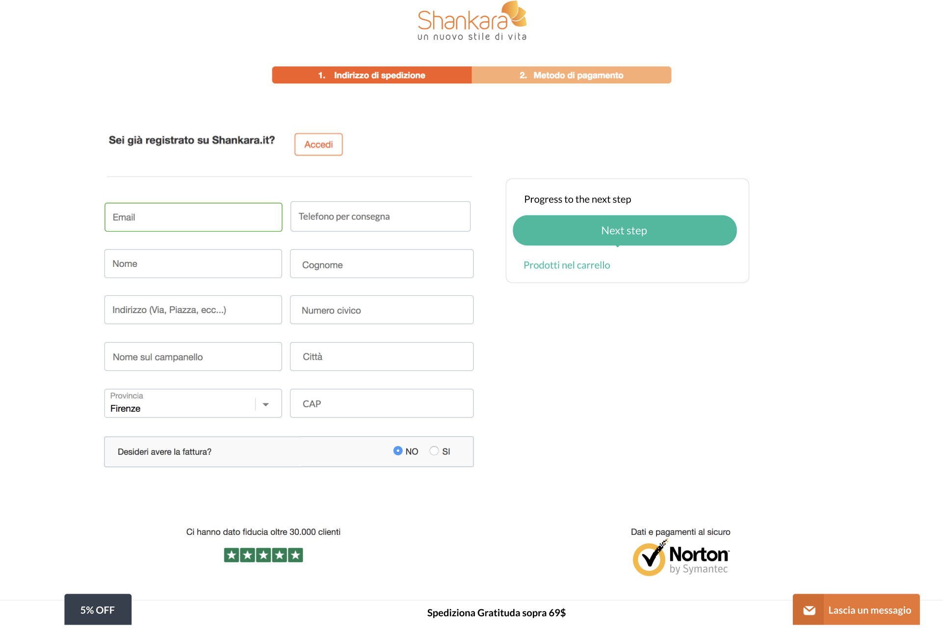
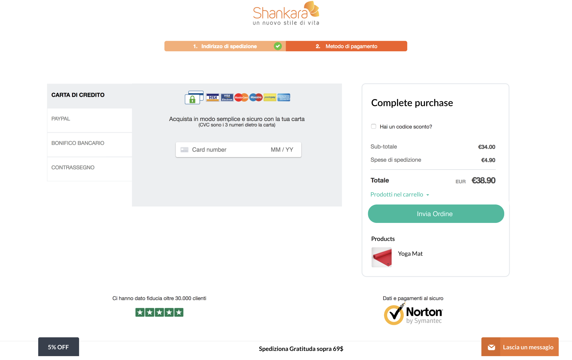
New Modern-looking Redesigned Pages
Process
Discovery & Audit
I began with a heuristic evaluation and UX audit of the current website, identifying friction points across navigation, product discovery, cart usability, and responsive behavior. Heatmaps and basic analytics data (from GA) supported assumptions around drop-off areas.
Wireframing & Information Architecture
Collaborated with the client to reorganize the product taxonomy and simplify navigation. Introduced a tiered menu structure, revised filtering logic on category pages, and clarified key user flows (first-time buyers, returning customers, and wellness-curious browsers).
Created high-fidelity wireframes to prototype improved homepage, PLP (Product Listing Page), PDP (Product Detail Page), and cart flow—prioritizing clarity and product discoverability.
Visual Design & Brand Refresh
With a focus on natural, calming tones and whitespace, I evolved the UI to align with modern wellness aesthetics—drawing from lifestyle brands like Lululemon and Organic Basics. Introduced consistent card systems, stronger product imagery, clearer CTA buttons, and supportive typography.
Developed a mini design system to ensure visual consistency across mobile and desktop, covering UI elements, spacing tokens, and reusable components for development handoff.
Handoff
Presented the redesign screens in Figma, showcasing key flows for desktop and mobile. Collaborated with the development team to ensure feasible implementation of responsive components and optimized image handling.
Results
- Implemented clean and modern design
- Improved web navigation and bounce rates (post-launch analytics)
- Clearer user flows led to faster time-to-cart and increased product page engagement
- Refreshed brand look contributed to stronger user trust and alignment with wellness identity
- Foundation laid for future pages modularity and A/B testing
This redesign positioned Shankara.it as a more intuitive, beautiful, and conversion-oriented wellness eCommerce platform, without losing the soul of the brand.