Design System Case Study
Building a Scalable Design System from Scratch for a US based 150‑Person Financial SaaS Company
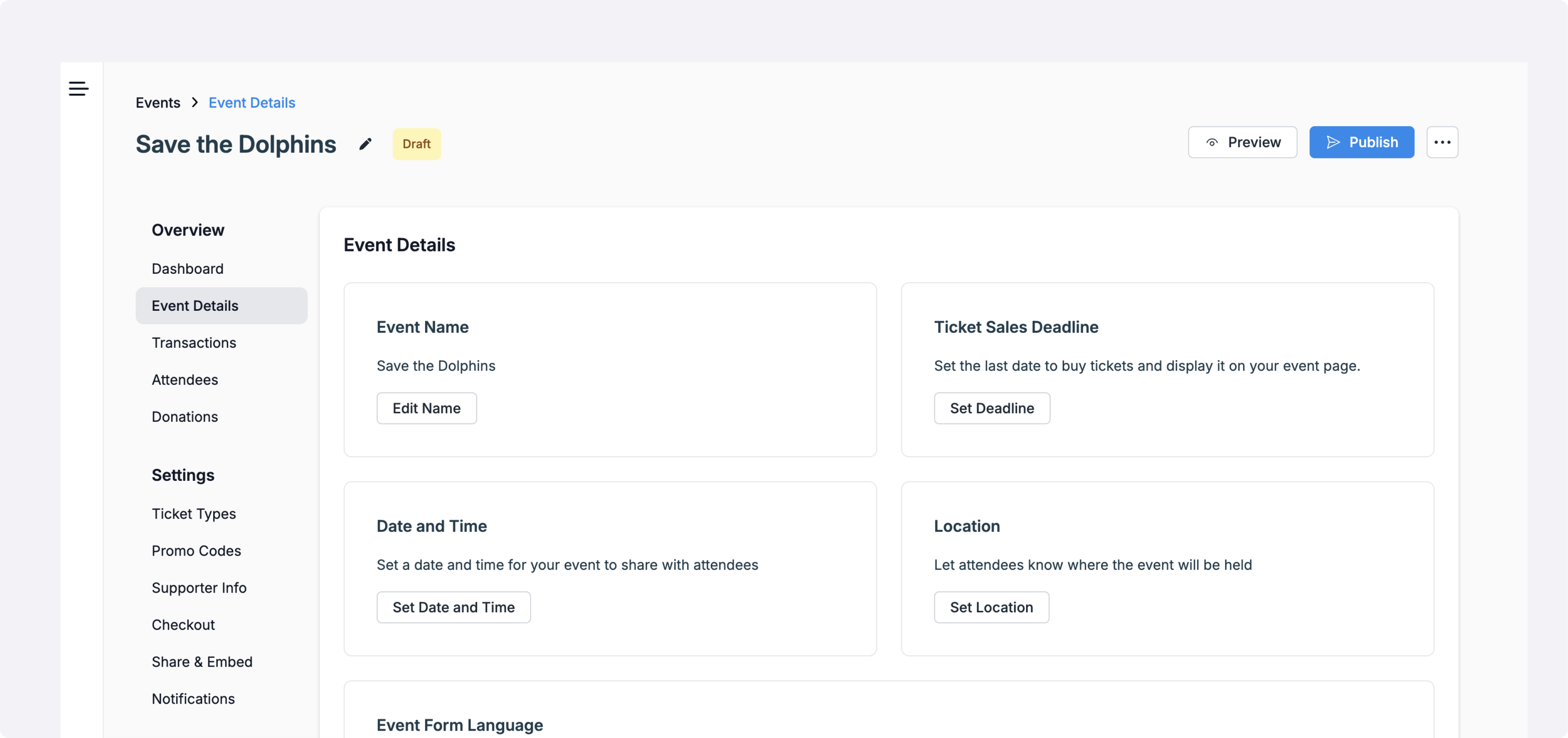
1. Project Overview
Company size: ~150 employees | Design team: 5 UX Designers + 1 UX Copywriter + me (design system designer Lead)
Duration: 8 months (end‑to‑end)
Primary tool: Figma Enterprise (Org plan)
Goal: Establish a robust, token‑based design system to drive consistency, speed, and quality across all product teams.
2. Core Problem
- No existing design system - designers frequently copied UI from old files.
- there was just a basic few elements with outdated UI style
- Inconsistent typography, color, and spacing across features.
- High rework cost: every visual change required manual updates in dozens of frames.
- Engineering received multiple, slightly different specs → UI drift in production.
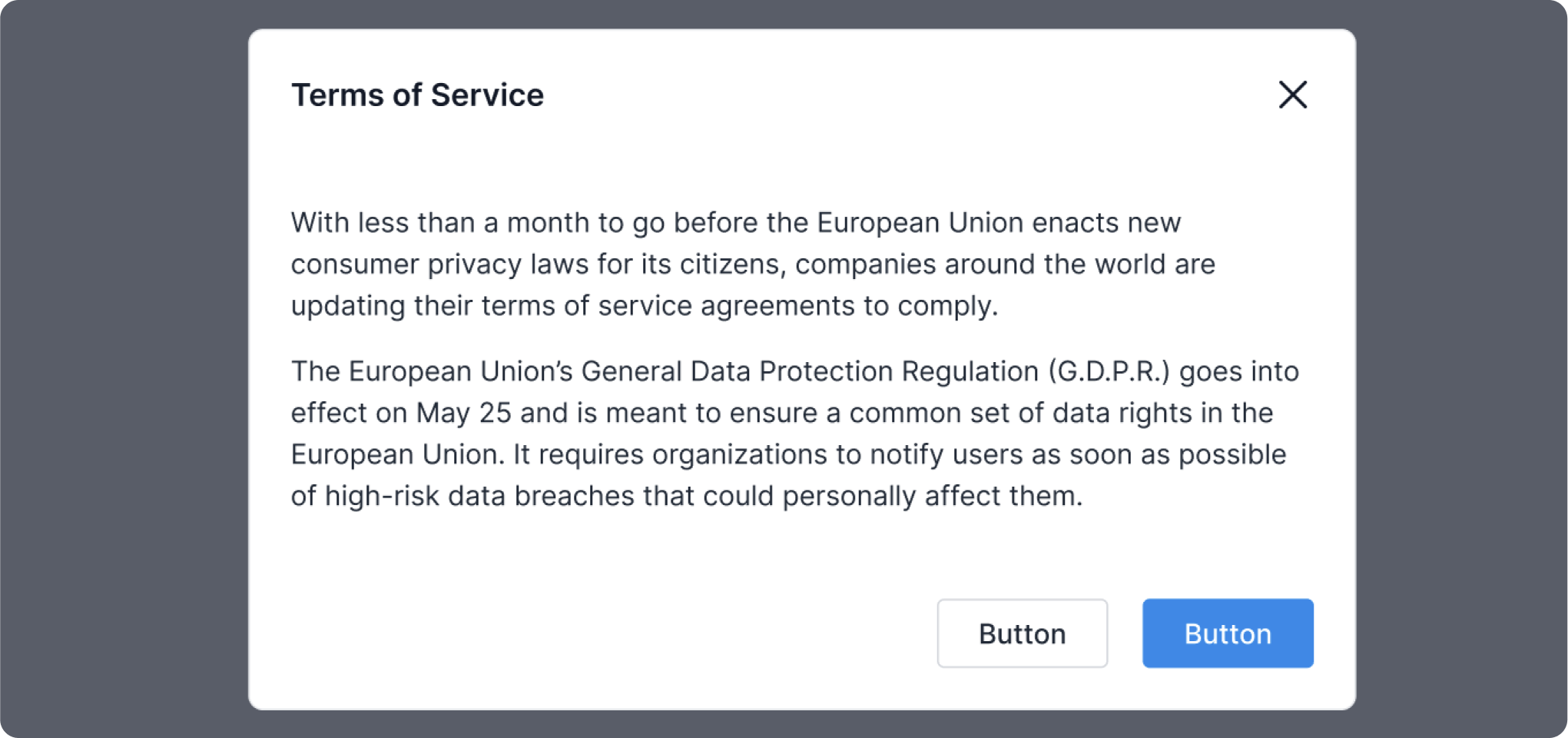
Previous UI style
3. My Role & Responsibilities
- Product Owner of the Design System - owned vision, roadmap, and stakeholder alignment.
- Defined visual language, variables initially - later token structure, and governance process.
- Led weekly design‑system stand‑ups, coached five designers, and partnered with front‑end engineers for implementation parity.
- Authored initial internal documentation, do/don’t guidelines, and onboarding material.
4. Approach & Methodology
- Audit & Gap Analysis – Reviewed 120+ screens to catalogue visual debt.
- Define Style Foundations – Established a core palette, new primary color (blue), typography scale, elevation rules.
- Variables Architecture – Created color, spacing, radius, tokens in Figma Variables.
- Component Library – Built atomic components in loose format
- Documentation & Adoption – Internal documentation, in 2025 started implementing specialized app Supernova
- Feedback & Iteration – Monthly audits, Slack channel for Q&A.
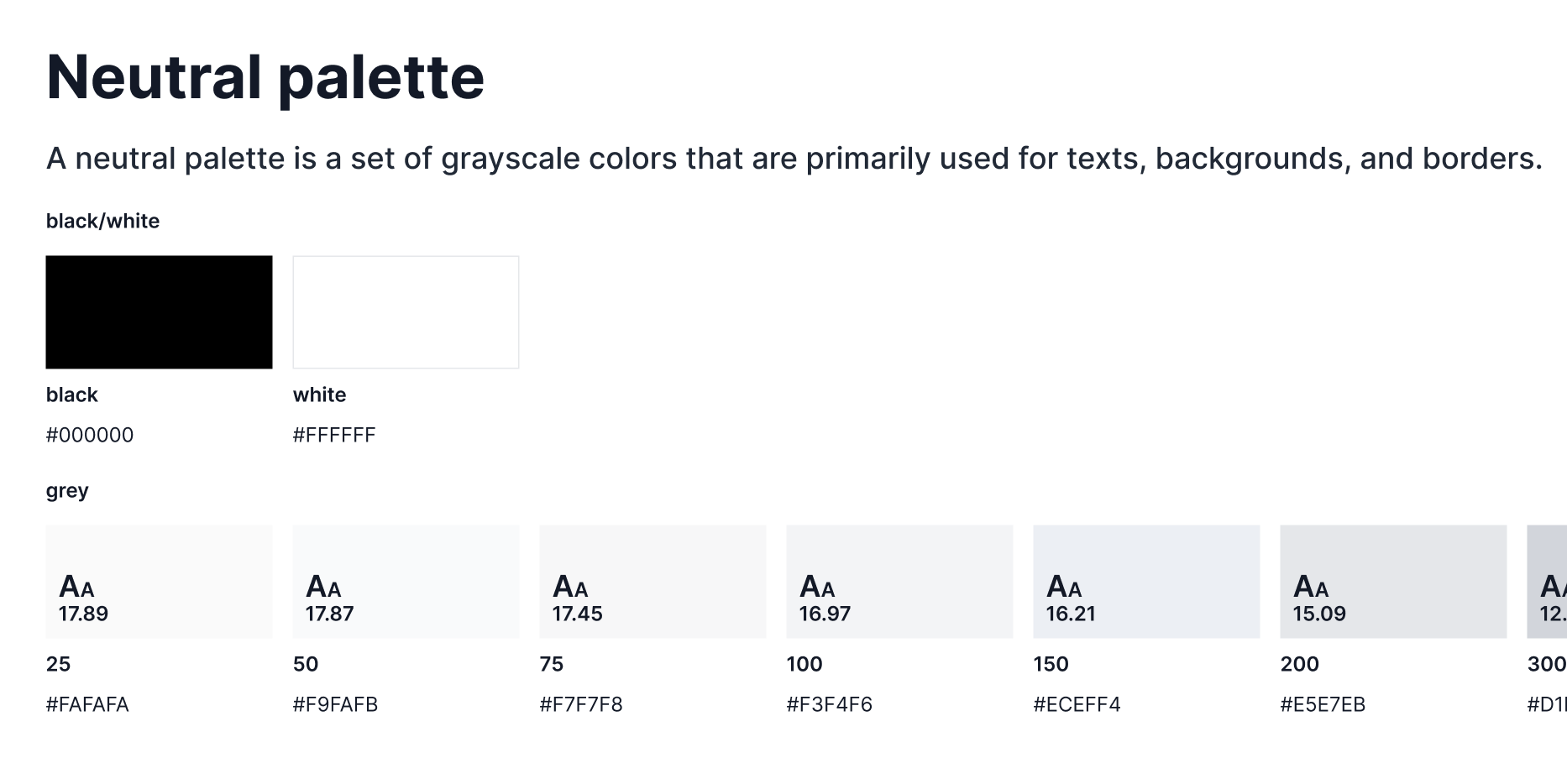
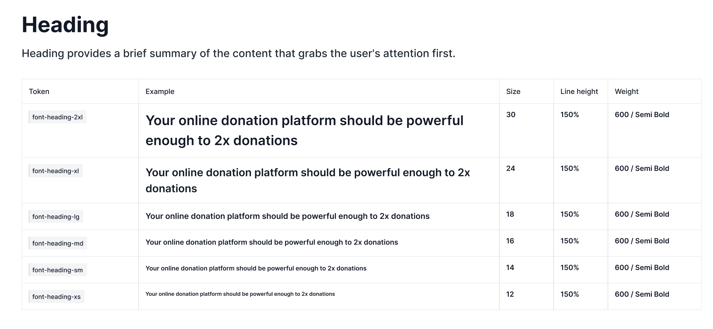
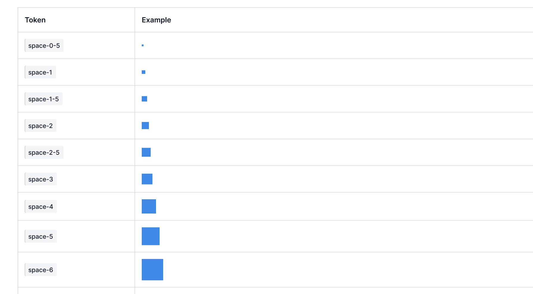
5. Style Foundations
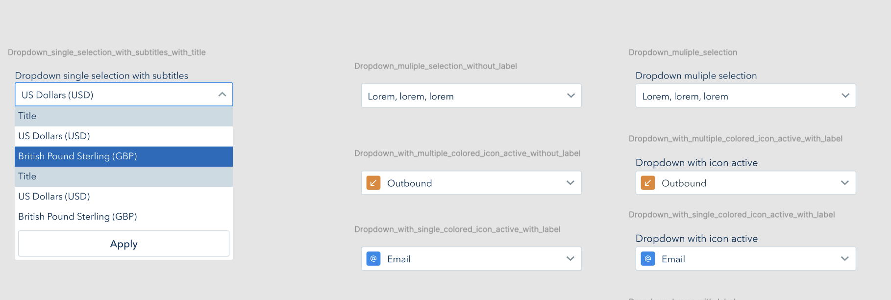
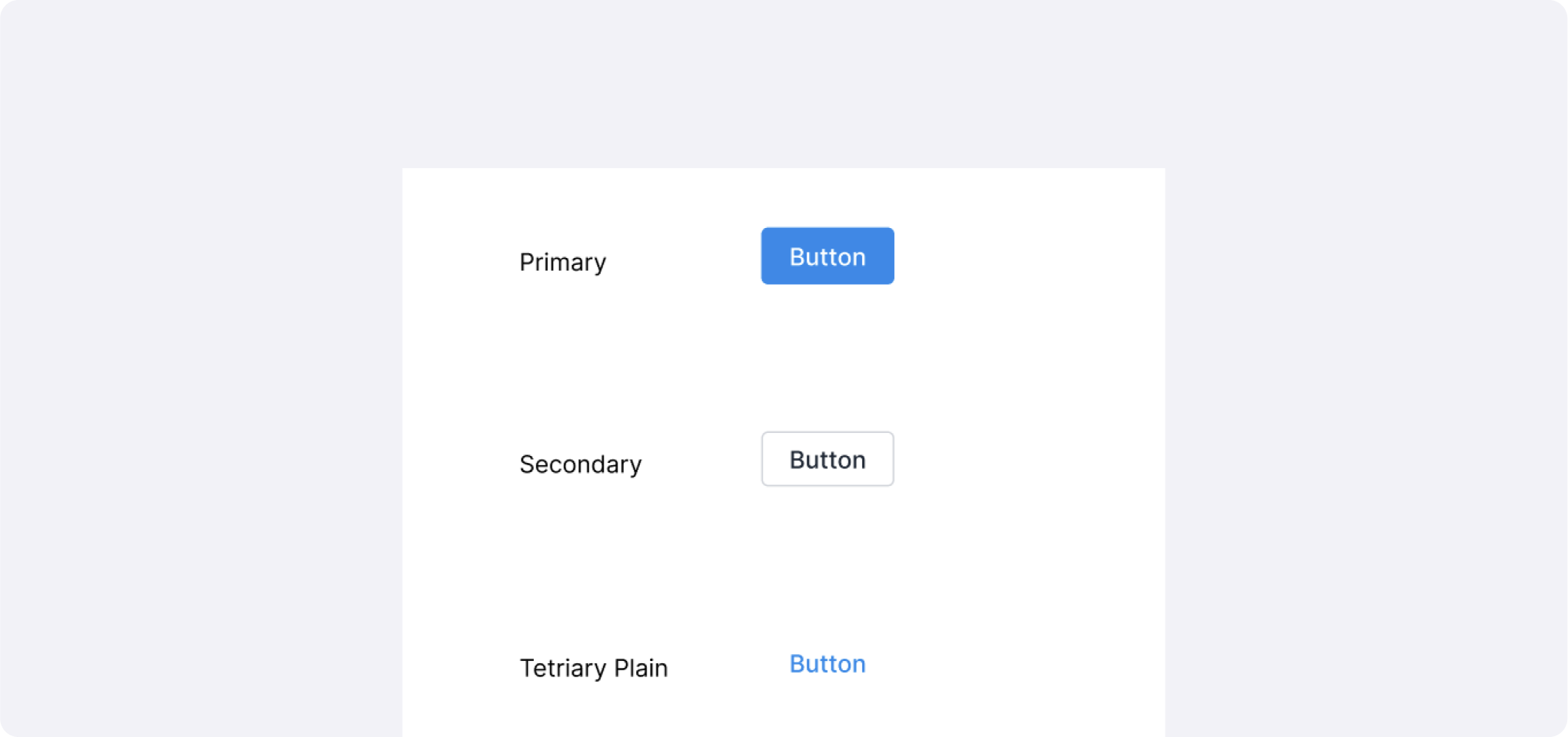
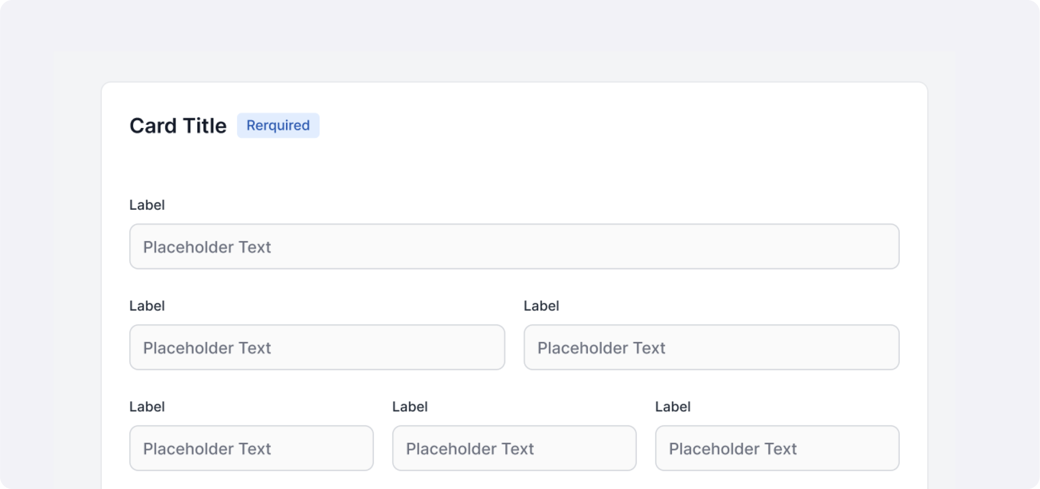
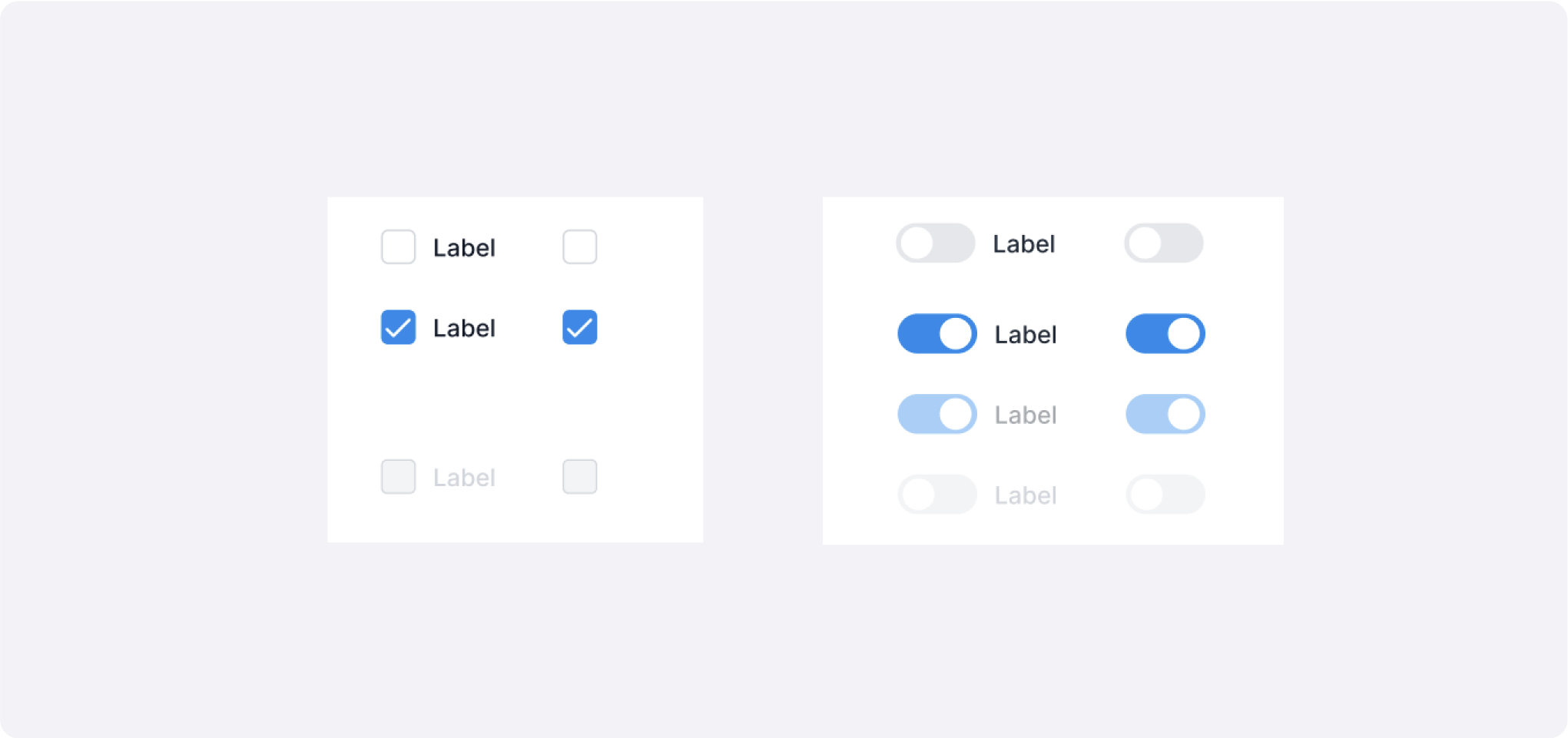
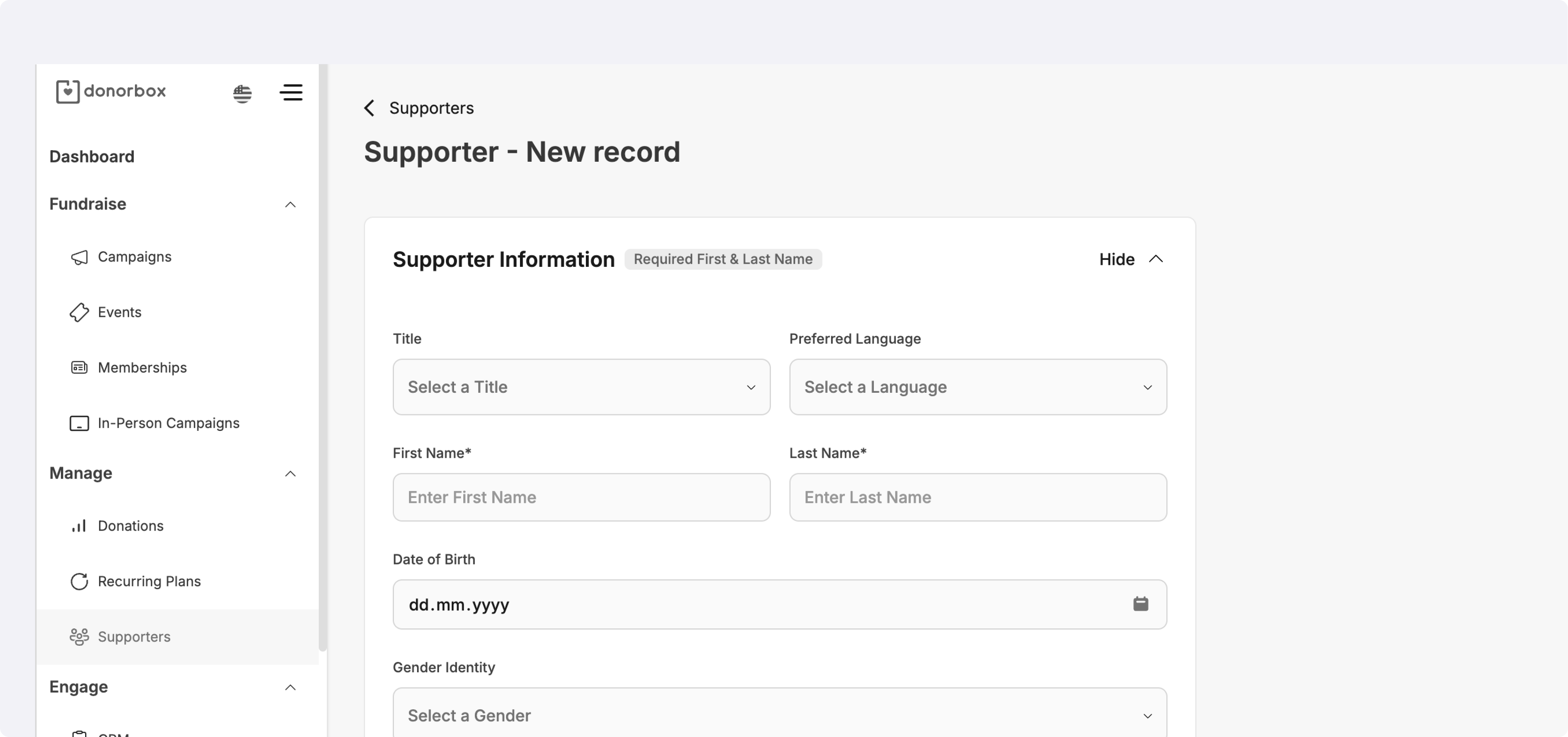
6. Key Components (30 Highlights)
Components
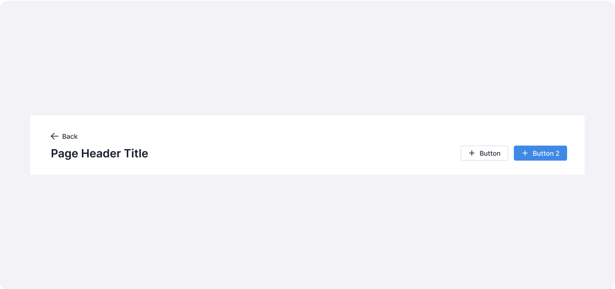
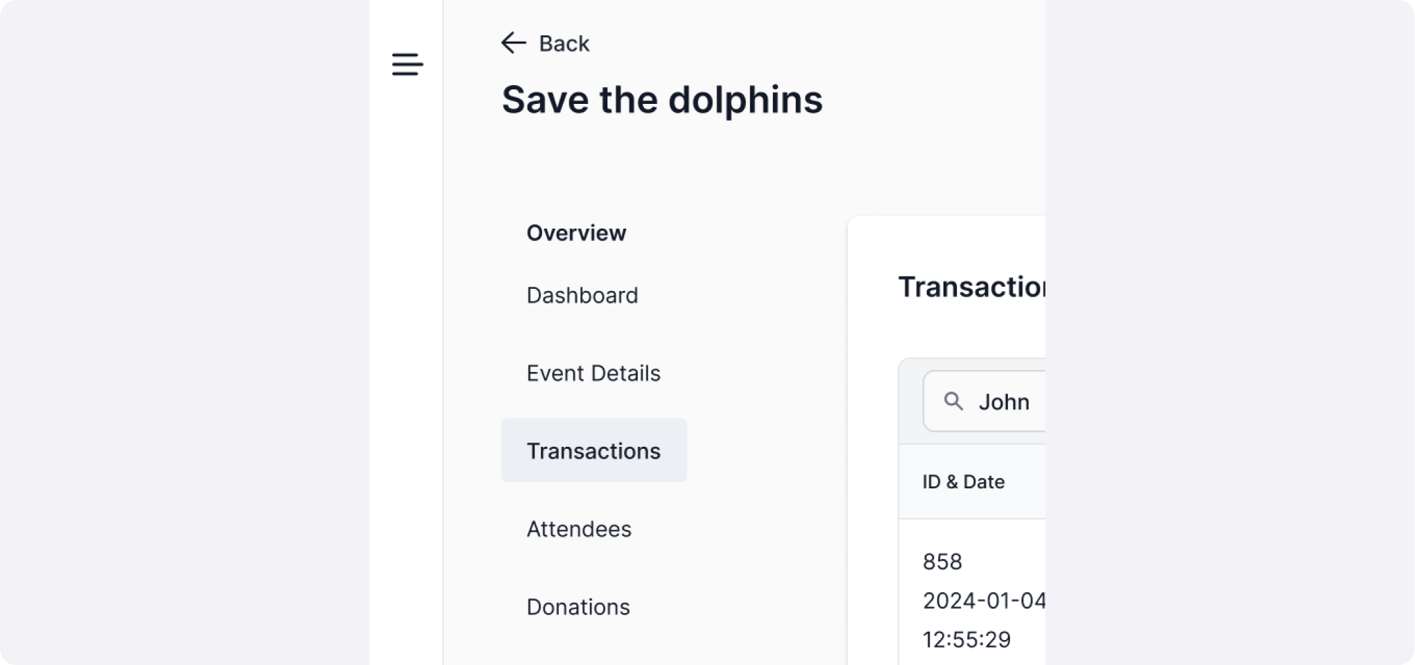
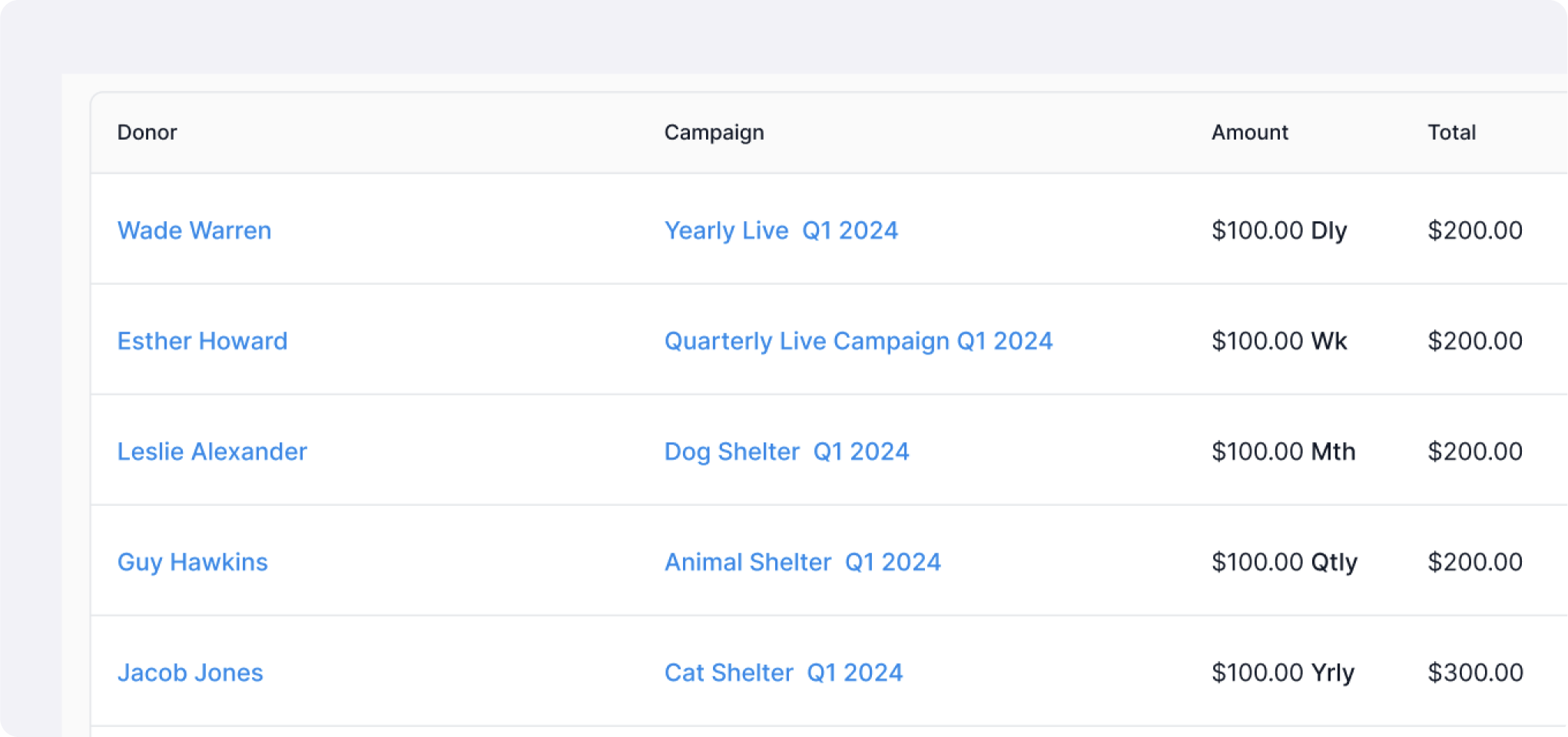
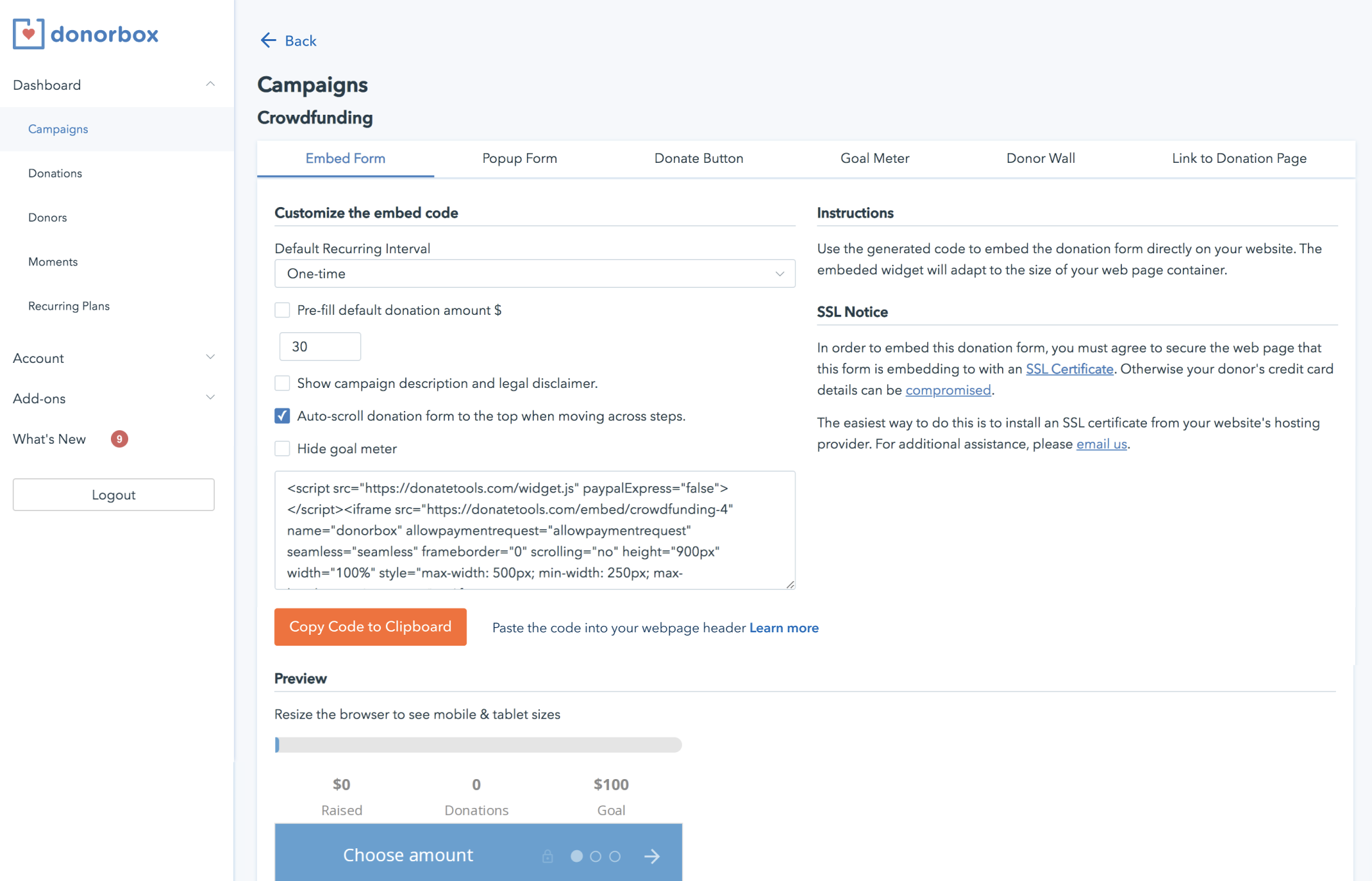
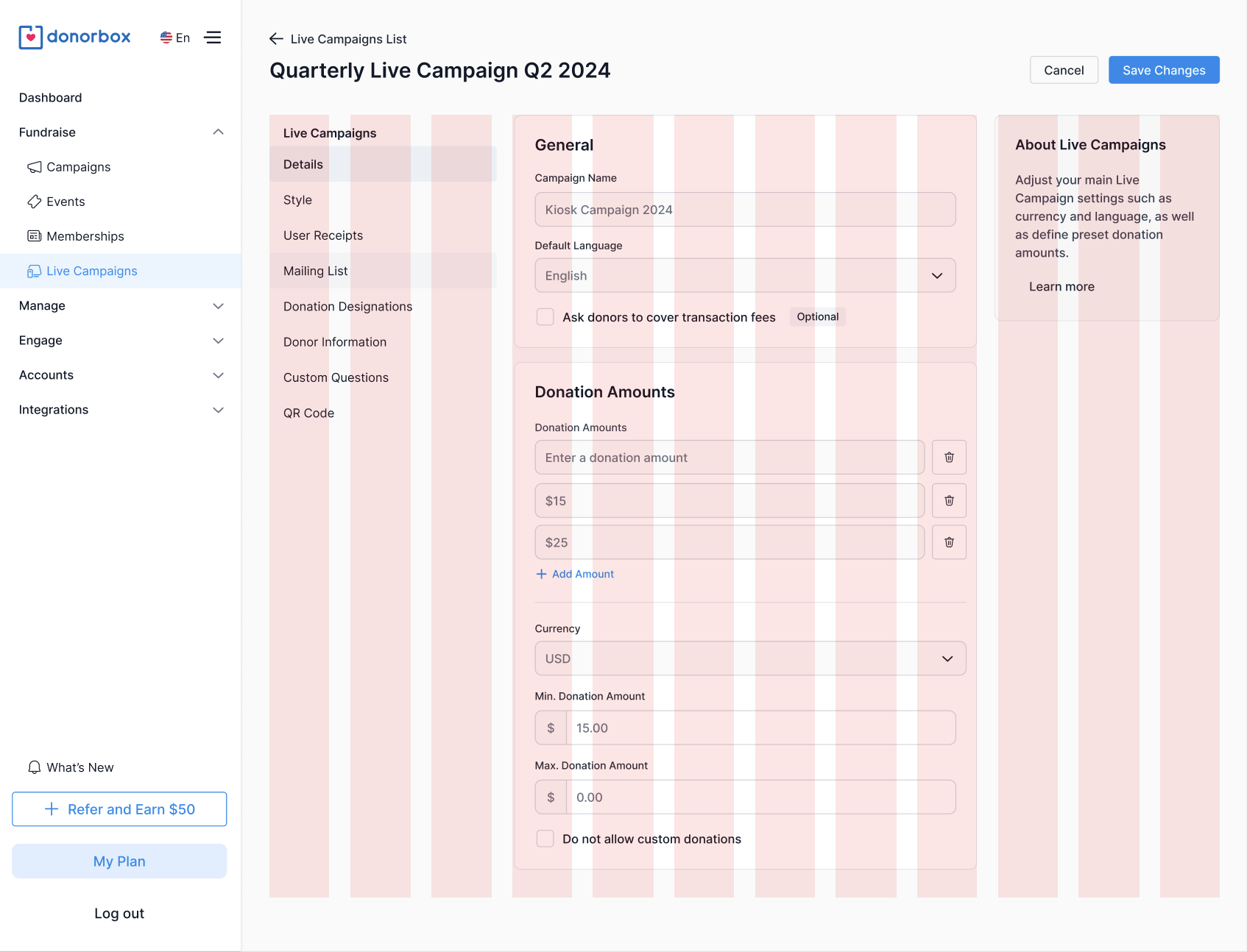
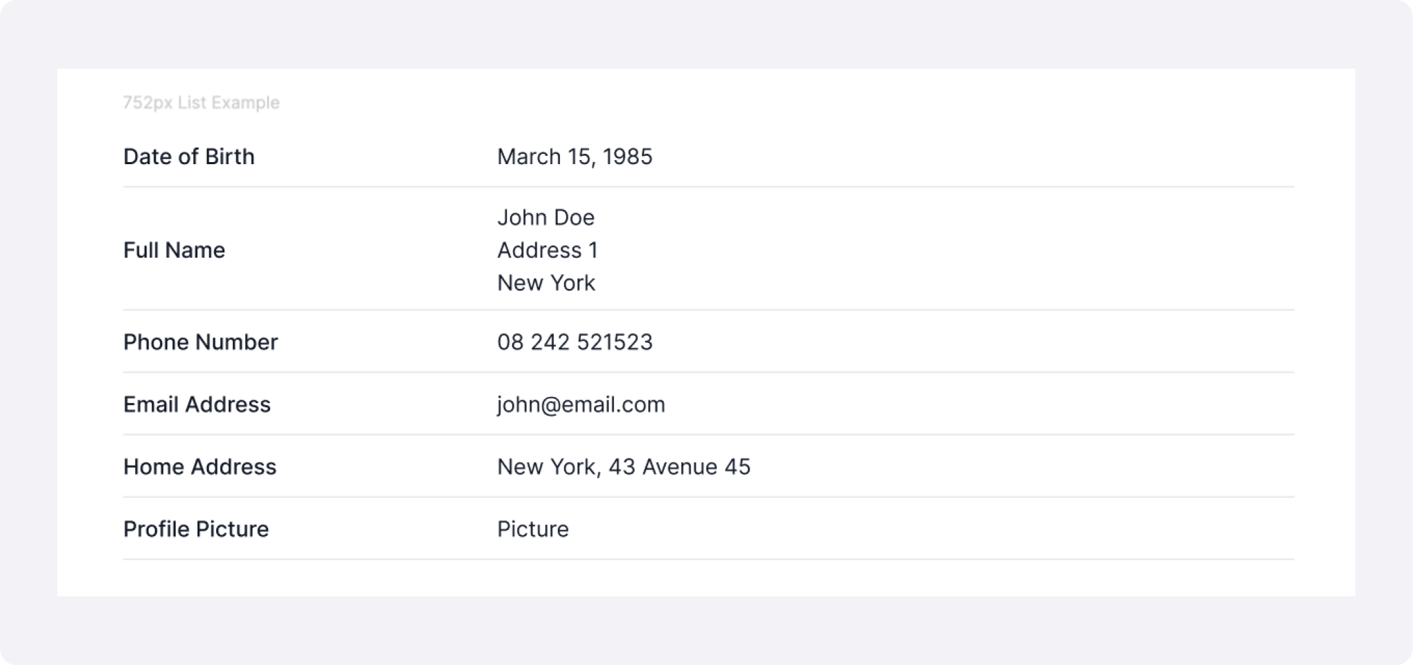
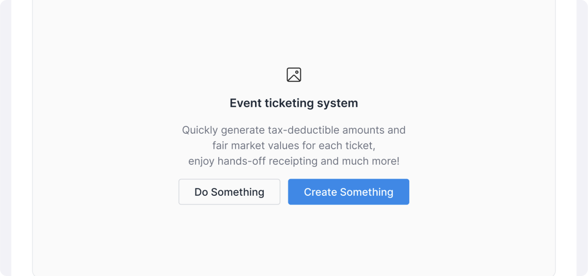
Pages Examples
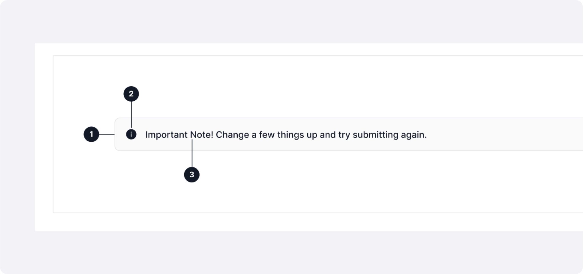
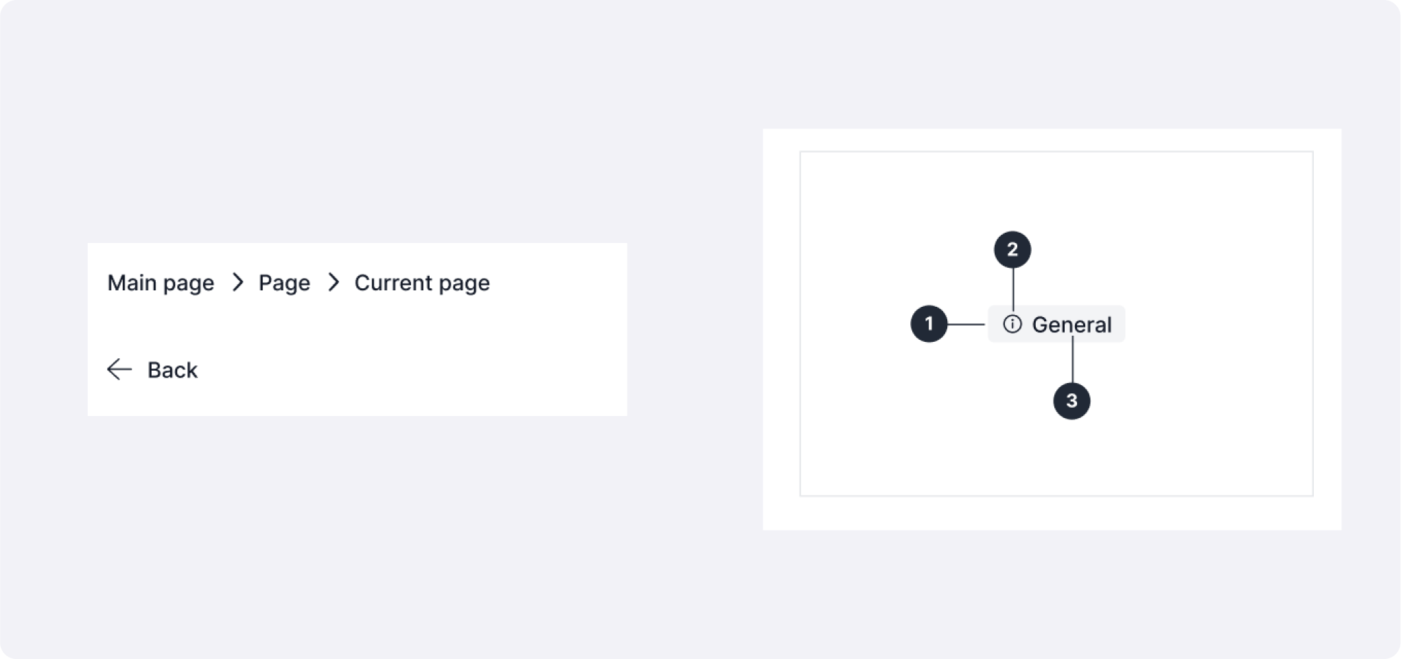
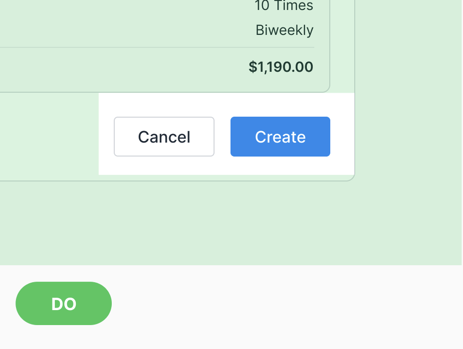
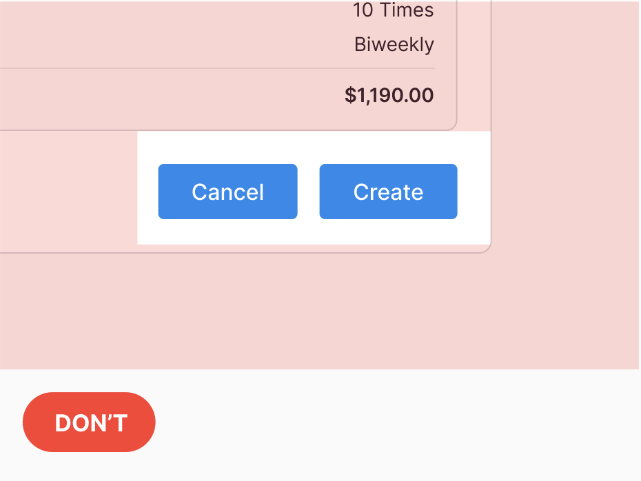
8. Interaction Patterns
- Form validation (inline + toast)
- Progressive disclosure (steppers, accordions)
- Table interactions (filters, columns)
- Responsive guidelines for breakpoints 480 px, 768 px, 1200 px.
9. Documentation & Governance
- Internal documentation hub with do/don’t examples and code snippets.
- Initially I created all the basic around 40 components
- Later contribution model: designers submit PR via Slack or design the intitial component version, reviewed weekly.
- Slack channel for support & Q&A.
- Quarterly audits = prune, refactor, deprecate outdated patterns.
10. Results & Impact
- Consistency: large reduction in UI discrepancies across 3 products.
- Efficiency: New feature mock‑up time speed increase
- Developer Happiness: Figma‑to‑code parity medium increase, fewer rework tickets and less QA work.
- Team Alignment: 5 UX UI designers, UX copywriter, UX researcher and developer team now share a single source‑of‑truth.
11. Reflections & Learnings
- Early token architecture prevents later visual debt.
- Documentation upkeep is as important as component creation.
- Regular feedback loops keep adoption high and system relevant.
- Multidisciplinary buy‑in (PM + Eng) is key for lasting success.