Rise and shine educational mobile app
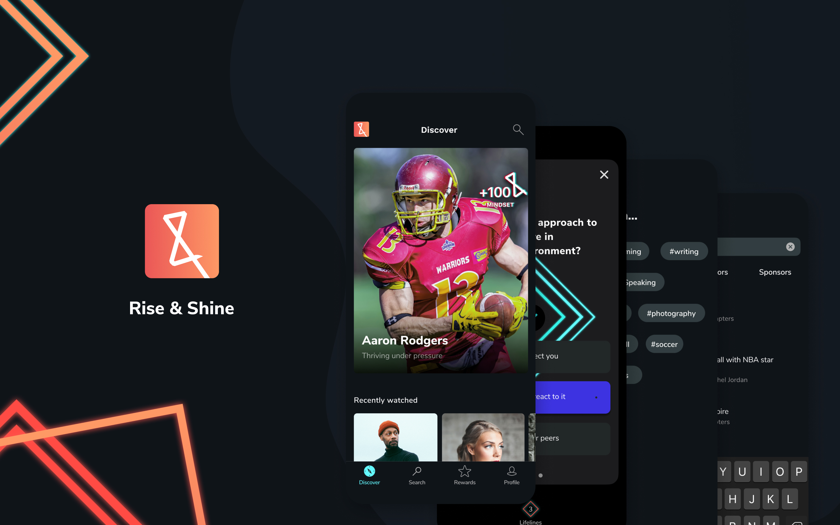
Education is the most valuable asset anyone can have - especially for youth. Rise & Shine focused on bringing high-quality content to youth and create an educational platform.
The goal was to create a platform with an excellent user experience that would engage youth and motivate them to learn new skills.
I lead the the user experience and user interface design on the platform. Through research, UX, and UI solutions, the small design team was able to create a platform that meets their users' needs.
Work done
- UX research
UX and UI design - Mobile app design
- Web administrator dashboard design
Team
- UX UI design lead (me)
- Junior UX UX designer
The process
We combined our knowledge and started talking to potential users to confirm the hypothesis. As we approached every task, we offered only solutions with the potential to evolve with the market. I determined which goals we should pursue first and created a roadmap for our project.
I lead the creating design concepts through wireframes and interactive prototypes. Every few days, I would update the client with designs and get their team's feedback. We needed to include the client in the design thinking process because we could highlight essential points in user journey maps and get their point-of-view on the topic.
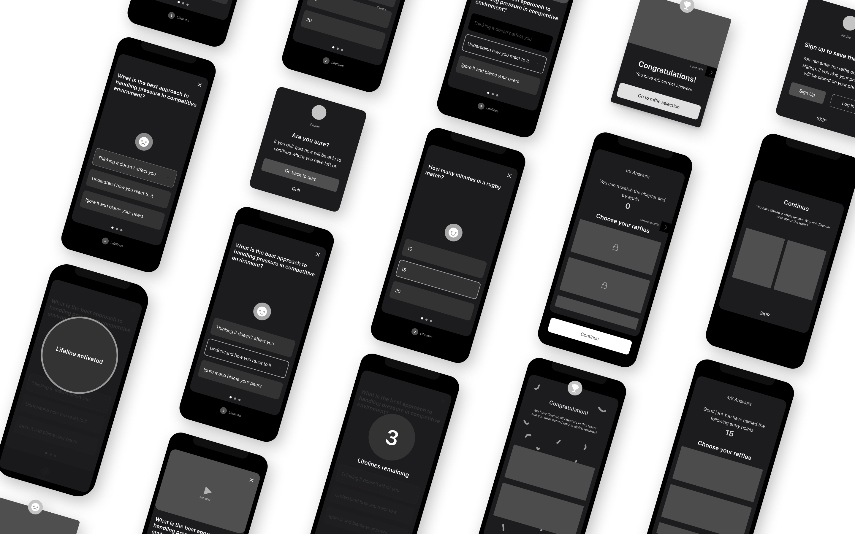
Once I have successfully defined UX design and the client's team agreed, we were able to move to the UI phase of the project.
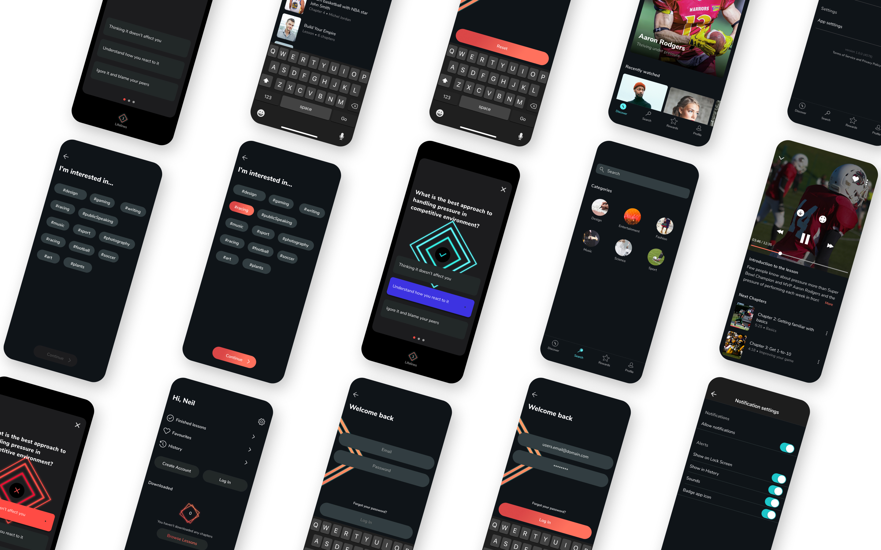
I have developed a style that would match the brand's identity and had enough flexibility if Rise & Shine decided to modify their identity.
I was also aware of keeping colors, elements, typography, and such to a minimum to make development efficient and cost-effective.
When the client confirmed the first visual style of the product, I tested it with users. With a few refinements, I was able to produce a product with which both the client and users were satisfied.
Challenges
There were many challenges we came across during our process. Some were easy to fix, but others were more demanding.
Research
The client and me took an in-depth analysis of Gen-Z, the target audience for this app. Gen-Z has a specific perception and they want fun stuff right away.
The participated users did not prefer complex user flows and dull content.
After a couple of quick user interviews and similar target audience apps research, we decided to change the app direction.
Finally, we choose Snapchat and TikTok simplicity and crafted user flow to be as attractive and straightforward.
Solutions:
- enlarged video height
- adapted the branding with vivid colors and bold shapes
- simplify user interface to smooth and intuitive use
1. Quiz challenge gamification
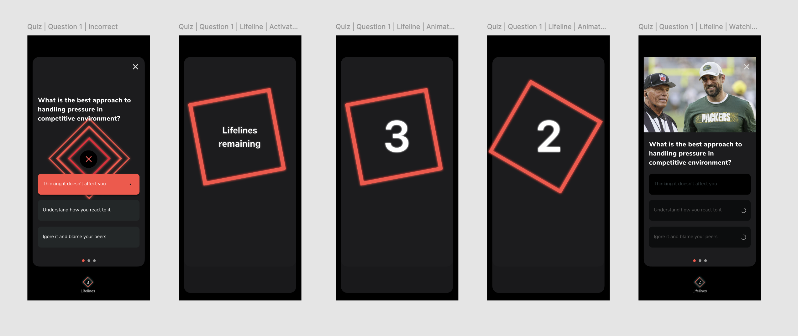
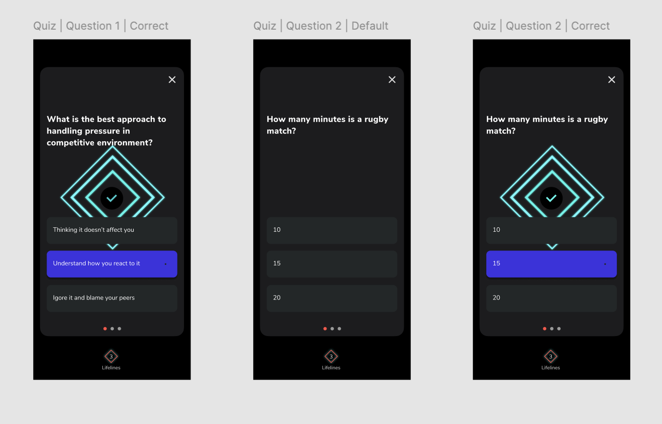
The quiz was one of the most complex tasks I needed to solve. The quiz in itself wouldn't be complicated, but in combination with lifeline systems, it became complicated. The quiz with lifeline options had
Multiple flow outcomes and each path influenced the points system.
Challenges:
- multiple flow outcomes
- each path influenced points system
- UI interactions take focus away from questions itself
To make sure the user won't be confused when playing the quiz, I had to test the quiz internally to see potential downfalls. There was an issue of letting a user know when the lifeline is activated and how it affects their score. I were able to solve the lifeline activation problem with full-screen animation.
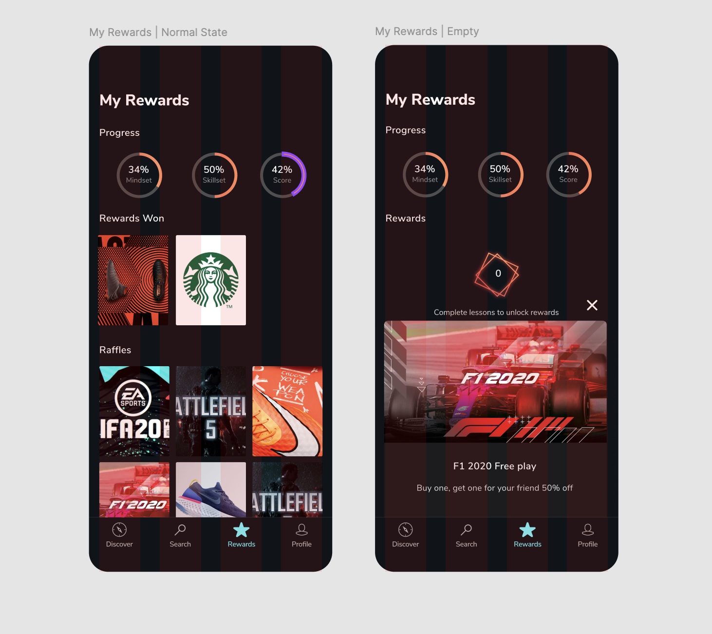
For fixing achieved points, I included a score of correctly answered questions and earned points at the reward screen.
At this point, I felt like user flow and UI had room for improvement and simplification. I proceeded to refine UI and removed unnecessary steps from the flow, which enabled users to focus on the questions rather than interaction within the quiz.
As a bonus, I have added animations and attractive visuals to ensure users feel ecstatic when they answer a question.
Solutions
- continuously internally testing the quiz to improve user flow
- clear information representation of user score
- removing some interactions for improvement of user flow
- adding visual animations to break-up monotone looking screens
2. Video format challenge
When I started our design process, I observed how most popular video platforms are handling playback.
Challenges:
- observing and choosing what style of video format and playback would fit the target audience the best
- defining what type of current and the future content format client will use for content
- increasing engagement with content
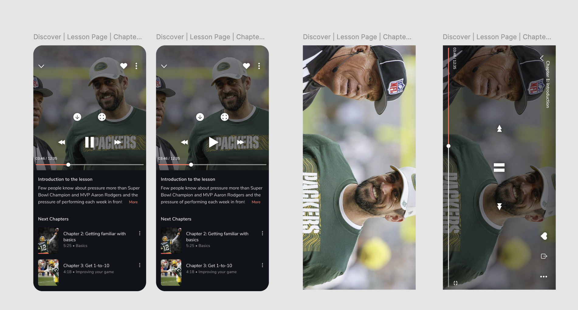
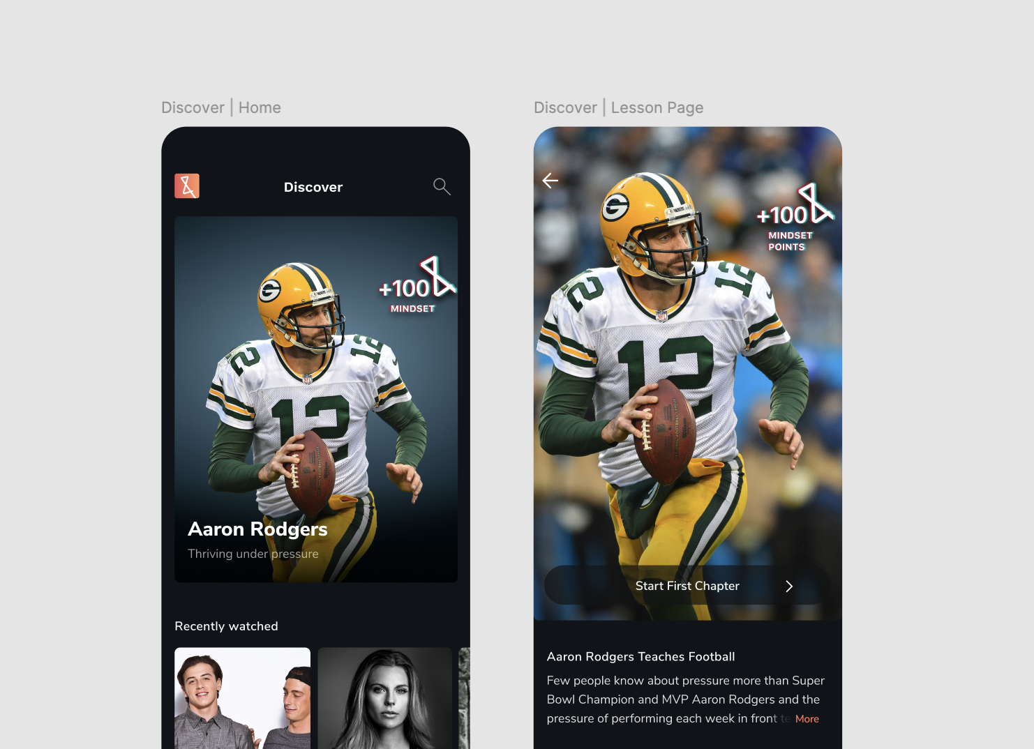
As a first solution, video size was set to the standard ratio (16:9). Still, as we tested our solutions, the standard Youtube height was not suitable for Gen-Z generation.
I decided to consult with a client further around their existing and future content to provide the best possible solution.
Our second take was to create a more flexible design that would adapt to various content formats. I were able to find a solution that maximizes screen estate and gives users maximum emersion into content while providing our client's content format to be more flexible.
Testing showed users liked a new solution and their engagement was higher.
Solutions:
- creating an adaptable format size to match content format
3. Branding and visual style
As the target audience of our client was a youth, I looked for more youthful solutions.
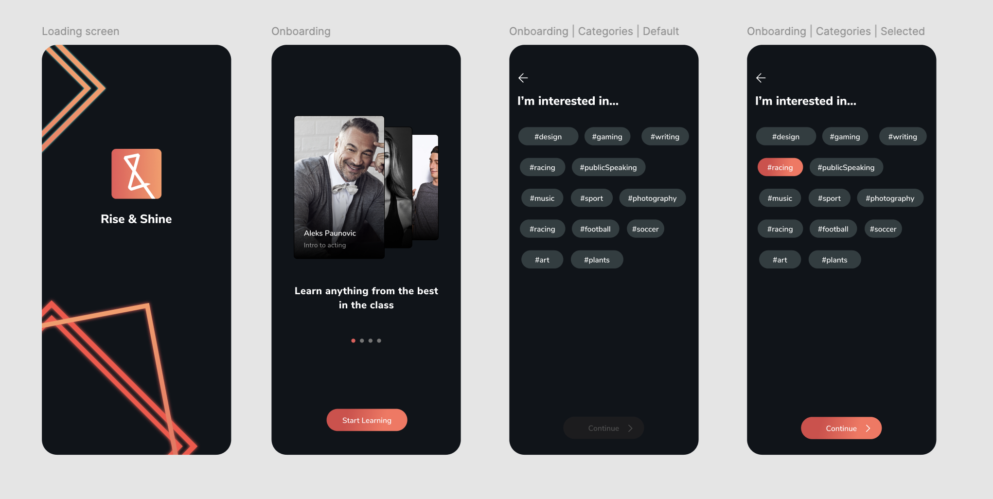
Challenges:
- design a visual style that resonates with Gen-Z
- making visuals future proof for all genders
At first, I went with simple colors and Snapchat like stickers, but we concluded we needed to bring more dynamic to visuals through additional research.
We went with a futuristic neon appearance and landed on a style that resonated with the target audience and our client.
The primary colors were selected to represent all genders and added lines as background elements to create a continuous style throughout the application.
Solution:
- choosing a neon visual style which is not specific to any gender, rather adaptable to all
- implementing a neon style to pastel and neutral screens to bring dynamic
Results
I helped Rise & Shine to create an educational platform.
Deliveries:
- flows and interaction logics in two weeks
- working prototypes and testing in two weeks
- application platform in four weeks
- administrator web platform in three weeks