donorbox - high traffic landing page redesign
Case Study: High-Traffic SaaS Landing Page Redesign
Context
The client’s main landing page was the highest-traffic entry point for their global fundraising SaaS platform. The existing design was outdated, cluttered, and not aligned with contemporary SaaS patterns. It didn’t effectively communicate the product’s value proposition to a diverse audience of nonprofits and decision-makers.
New Redesign
Challenge
- Outdated visual style that felt untrustworthy compared to modern SaaS competitors.
- Lack of a clear information hierarchy — value props, features, and CTAs were buried.
- Low clarity in driving users toward sign-ups and product exploration.
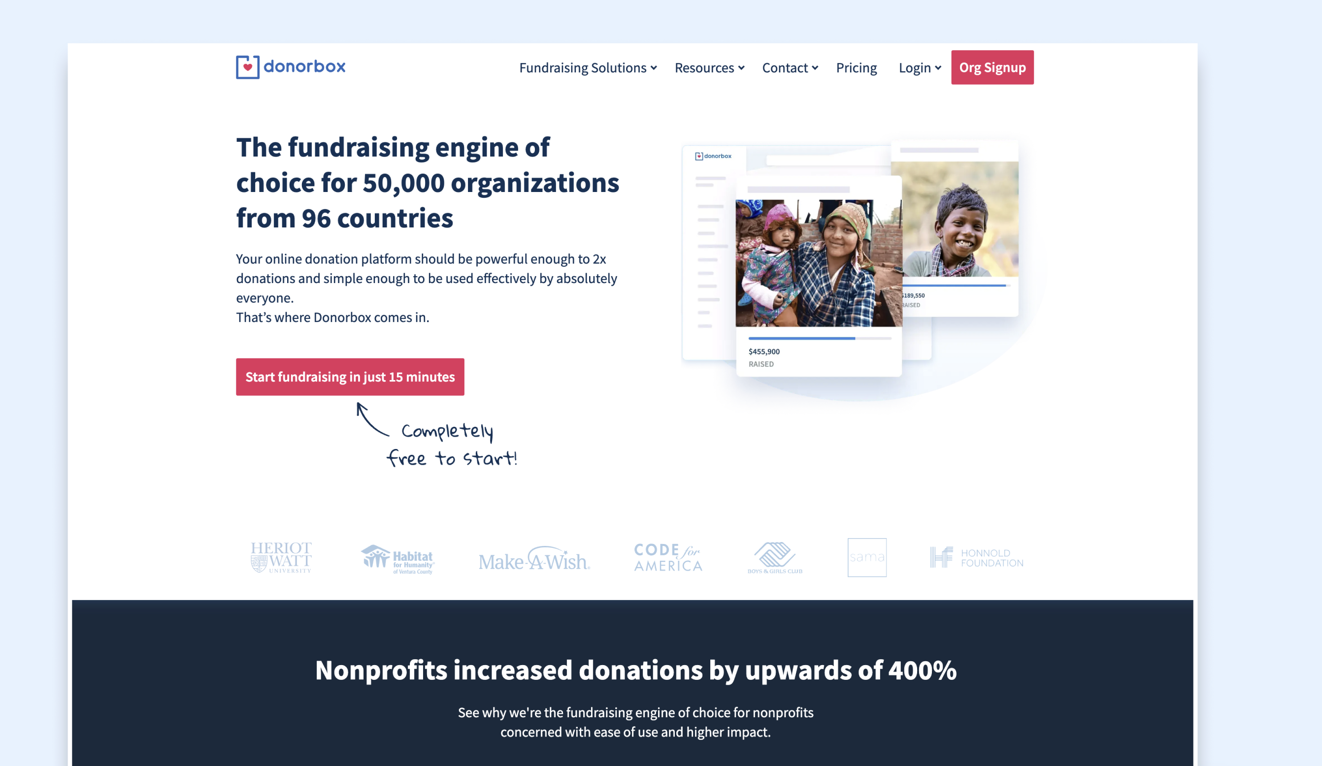
Before the Redesign Look
Approach
I applied a full UX/UI modernization to give the landing page a scalable SaaS look and feel:
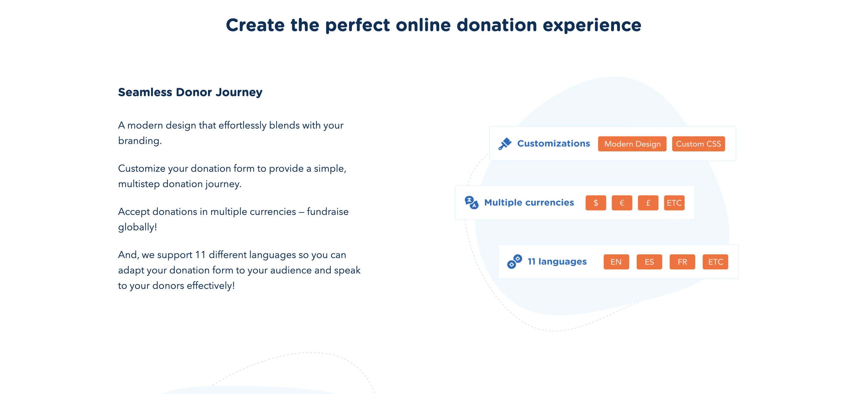
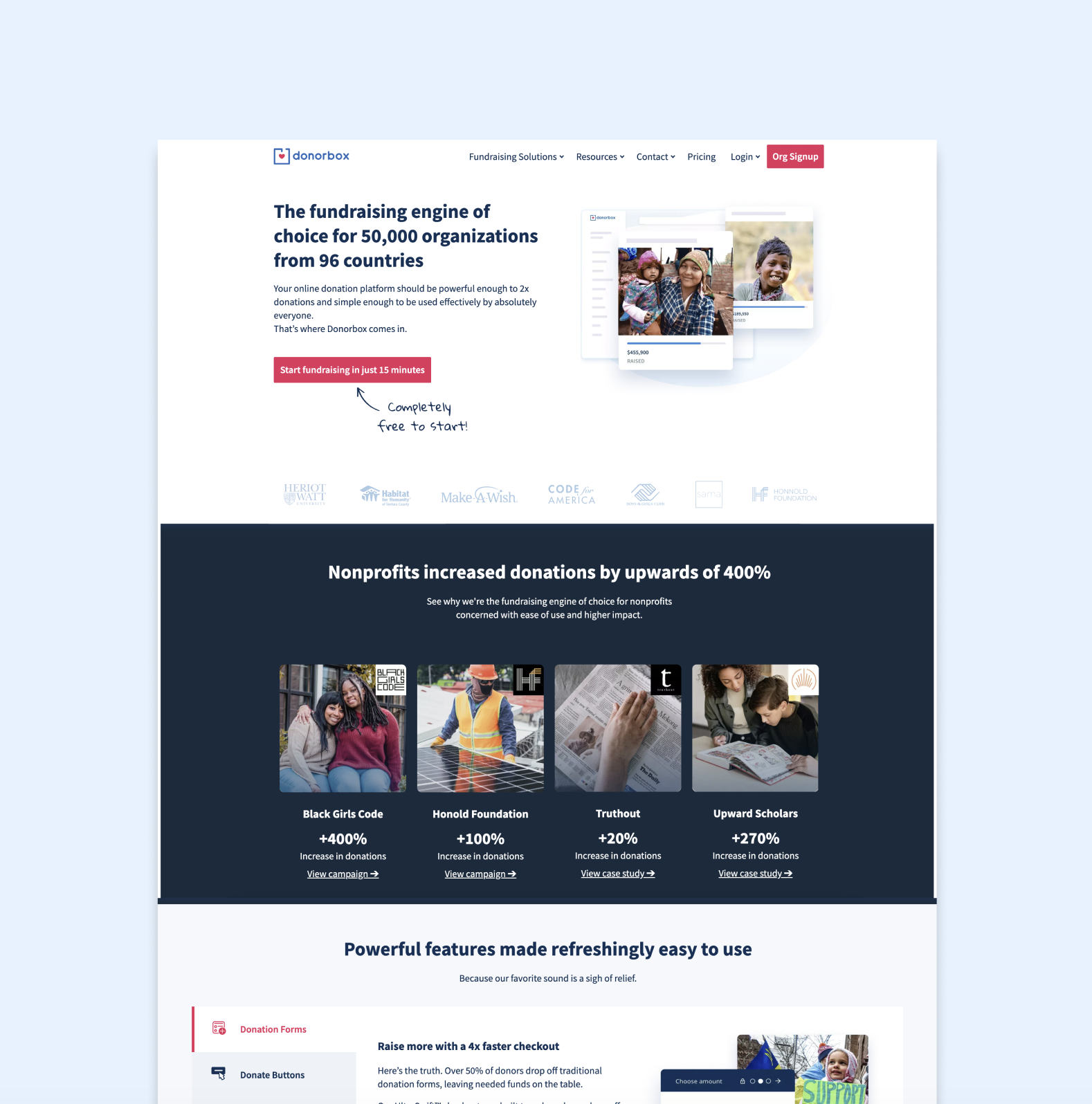
- SaaS-inspired design system: clean typography, consistent color tokens, structured grid system.
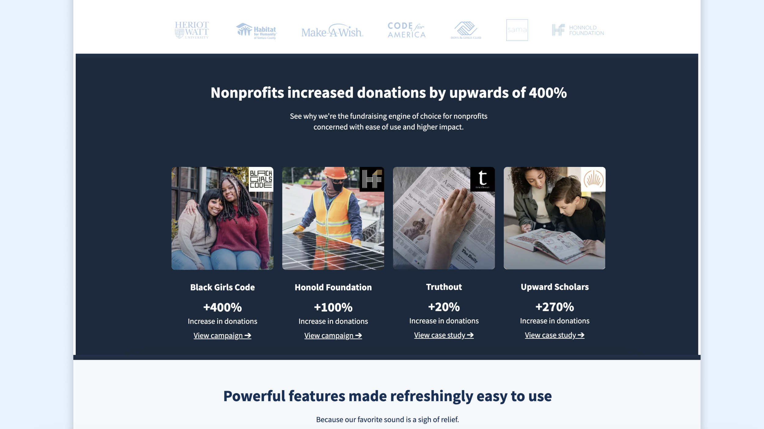
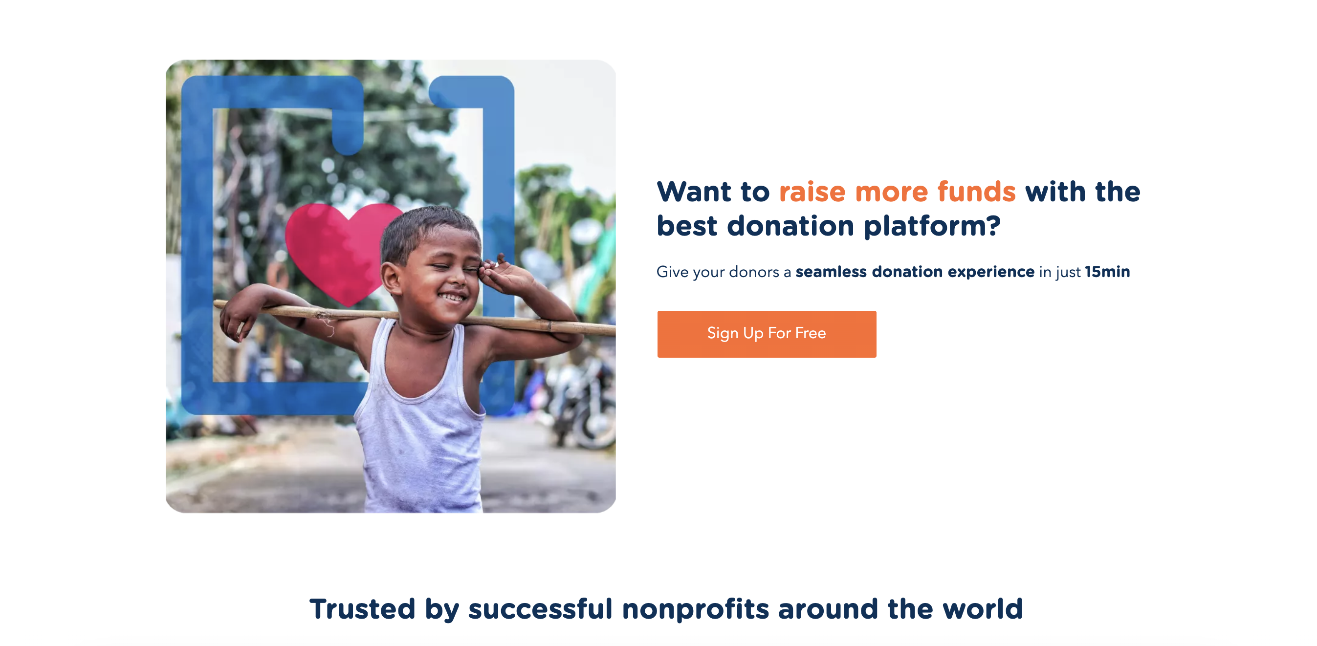
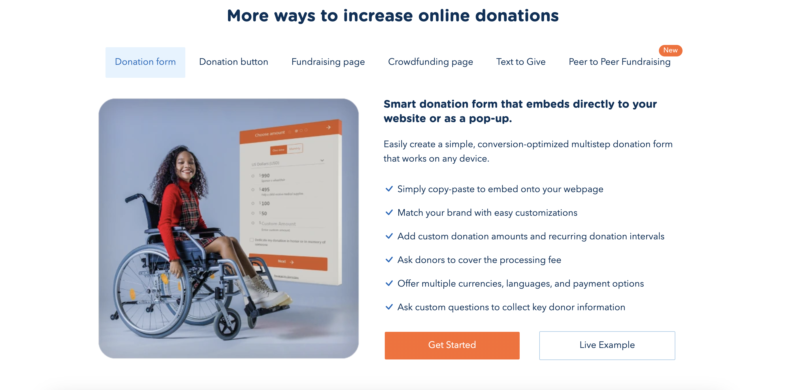
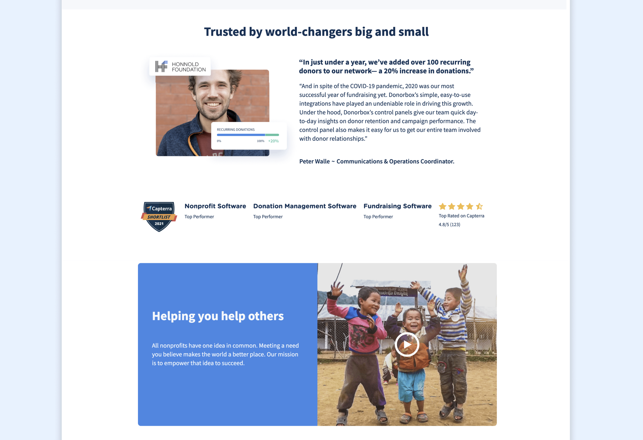
- Value-driven messaging hierarchy: repositioned CTAs, concise product benefits, and trust-building social proof elements.
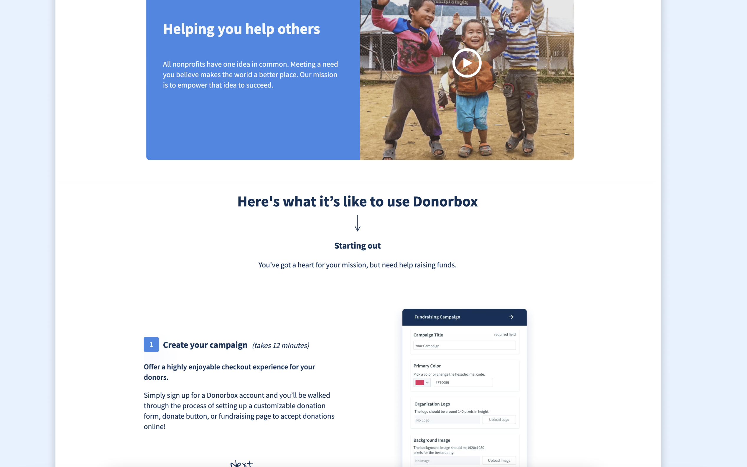
- Modern visual storytelling: introduced illustrations, screenshots, and brand-aligned visuals that conveyed credibility and ease of use.
- Optimized user journey: reorganized sections so visitors could understand what the product does within seconds and proceed directly to signup or demo.
Result
The redesign transformed the landing page from an outdated nonprofit-style page to a modern SaaS marketing front page. It established stronger brand trust, improved clarity of value, and better aligned with the product’s positioning in the competitive SaaS landscape.
Before (archived)
https://web.archive.org/web/20220401000922/https://donorbox.org/
After (archived)
https://web.archive.org/web/20220901012026/https://donorbox.org/