Download Report Now
We will send a download link to your email address
Oops! Something went wrong while submitting the form

5 top pain points in the retail eCommerce customer journey
Plus a detailed guide on how to alleviate them and turn into an advantage
Free PDF Report DownloadSee More Details FirstCase Study: B2B/B2C eCommerce customer experience
Donorbox is a widely used fundraising software, a donation form that is super simple to set up and attracts more reoccurring donors. Donorbox helps nonprofit organizations fundraise with a fast, optimized donation payment system.
Our challenge and goal of the design
The client wanted a scalable and adaptive web form that could fit into any website design. The challenge was to create a simple and clean looking donation box with fundraiser custom branding.
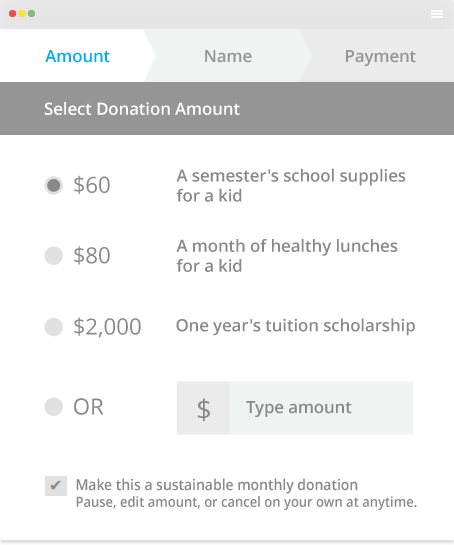
Original design prior to our redesign:
Customer experience design guidelines:
- simple to use, so simple that it does not show all the technological complexity that is behind it
- works seamlessly on different platforms and in various languages
- visually attractive, inviting for a customer to include it into the brand website
- ease the challenging donation process
- ease the process of entering personal info; government legislation requires that every donor must enter his full info
- achieve higher donation rates than the original form
- implement steps indicator
- in general, how to make the whole form scalable for different amounts of data
Of course, the overall goal of the design was to improve the conversion rate of the donation form and achieve higher donation rates.
Audit and Research
SuperSuper needed first to pinpoint the existing customer experience pain points.
We designed a simple persona and a customer journey map where some of the most pressing issues revealed very soon:
- the current form was difficult to navigate and to comprehend
- the visual appearance wasn't strong enough
- it lacked design clarity and was too cluttered
- the elements were not divided
- the elements were not inviting to click
- the flow of the interactions could be improved
The competition research also revealed better user patterns we can use to increase conversions.
Our intended solutions was to address the pain-points and innovate on several key areas:
- custom color for each company
- new codebase (material design library) with smoother interactions
- we kept three steps
- fixed width and scalable form height
CX Challenges
Visualizing the amount of donation was crucial as it was the first and perhaps the most essential part of the donation process in the user's eyes.

1. User Flows
We had to consider multiple user flows:
- the donation form can be any branding color chosen by the brand owner - the color was important to integrate into the donation from customer brand webpage
- because of the donation law, the interface needed to support extensive personal information inputs while keeping the customer focused on donation
- the donation company can suggest 1-10 different payment amounts
- the customer can select a recurring or one-time donation
- the customer can choose three different payment option
- the customer can choose to save account
- the customer can log in quickly with Facebook or email
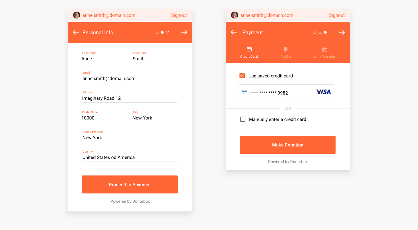
2. Three steps Information architecture
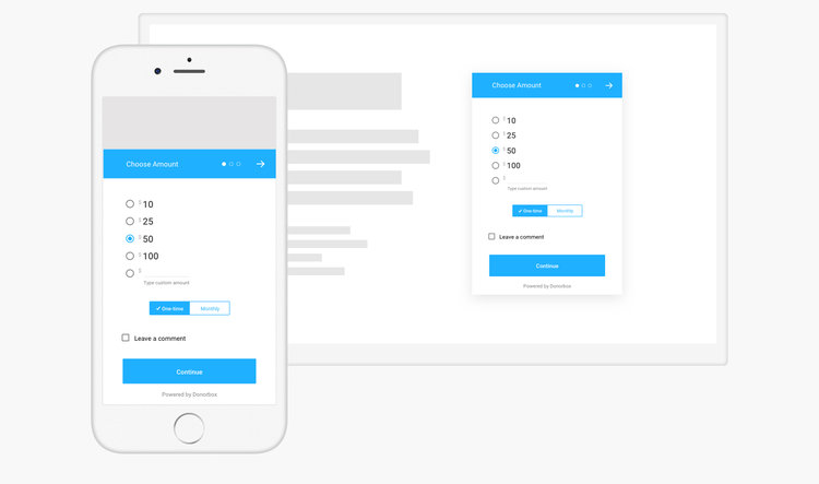
The user had to be able to choose the amount easily, and there was no room for any potential mistakes while selecting the amount. SuperSuper kept the donation as a three-step process:
1. step: donation amount
- selecting the desired amount of donation
- selecting whether it is one-time or reoccurring
- adding a comment
2. step: adding personal information
- name
- address
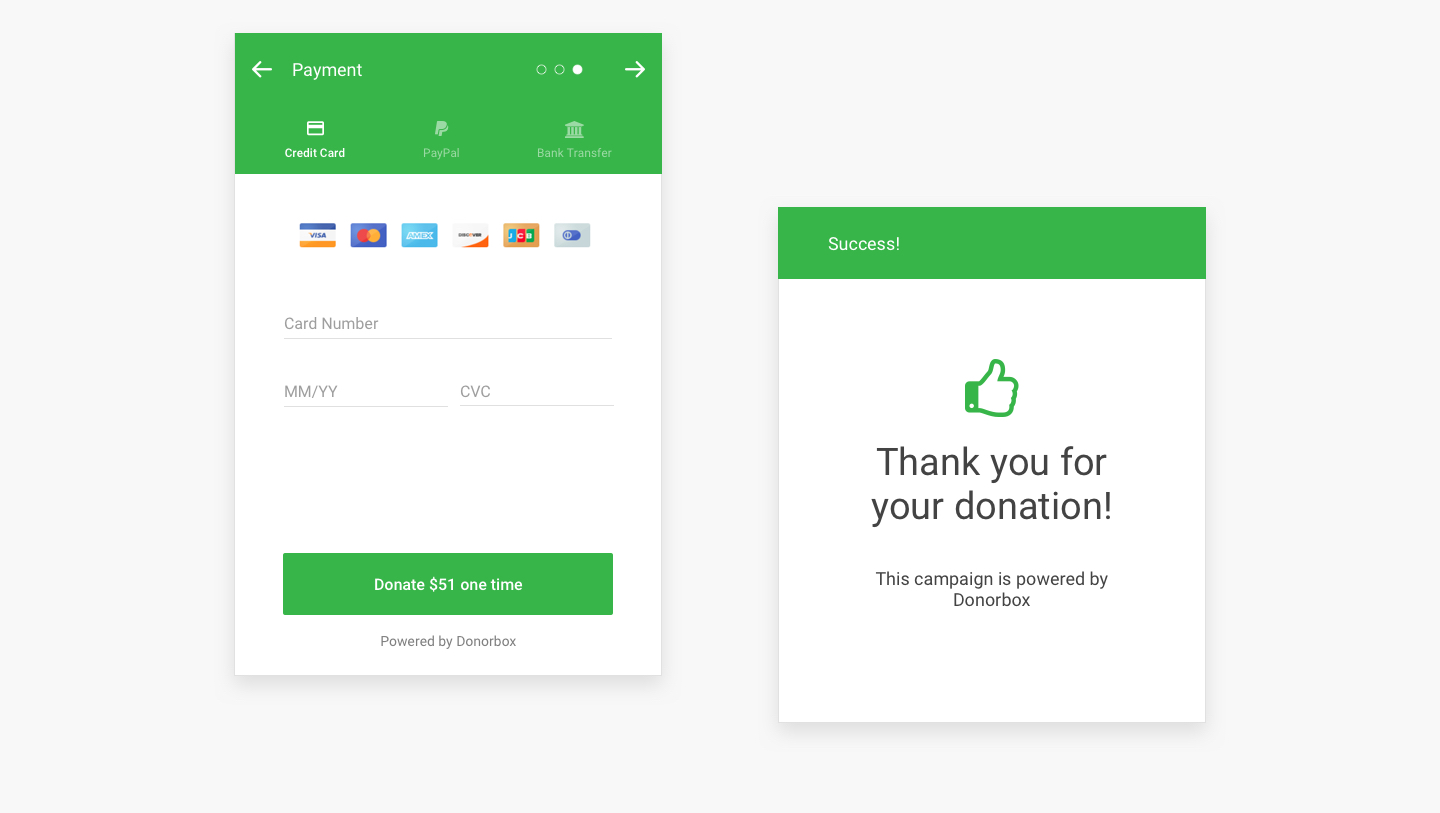
3. step: adding payment information
- credit card
- Paypal
- bank transfer
Keeping complex tasks into three steps made the donation form clear and understandable for most of the users.
3. Clean and modern UI
We have chosen the Google material design library for the user interface as it offers the best experience from the speed, development, options range, and design clarity.
We optimize the input fields, and the whole interface to emphasize important elements only, with a lot of space to avoid clutter.
We positioned every element to ensure that the user did not get overburdened visually and mentally before finishing up the donation.
We optimize the whole design for conversions, and we waged several options for every single element before signing to the final solution.
Testing and optimizing
Testing assured that the small glitches do not compromise the overall conversion rate and customer experience. We tested the form flow with several testing users in all possible combinations and streamlined potential friction points.
For example:
- unexpected interactions occurred with different currencies symbols that overflow and break the layout
- we concluded that the optimal amount of proposed donation amounts is 3-6
- we tested how the branding color will impact the buttons
- we tried the version where recurring donation toggle is above the donation amount select option
- we tested different UI designs for login and signup
- we tried different login and signup positions
After several iterations of improvement initiated either by us, the customer or the client, we concluded that the form was ready for actual development.
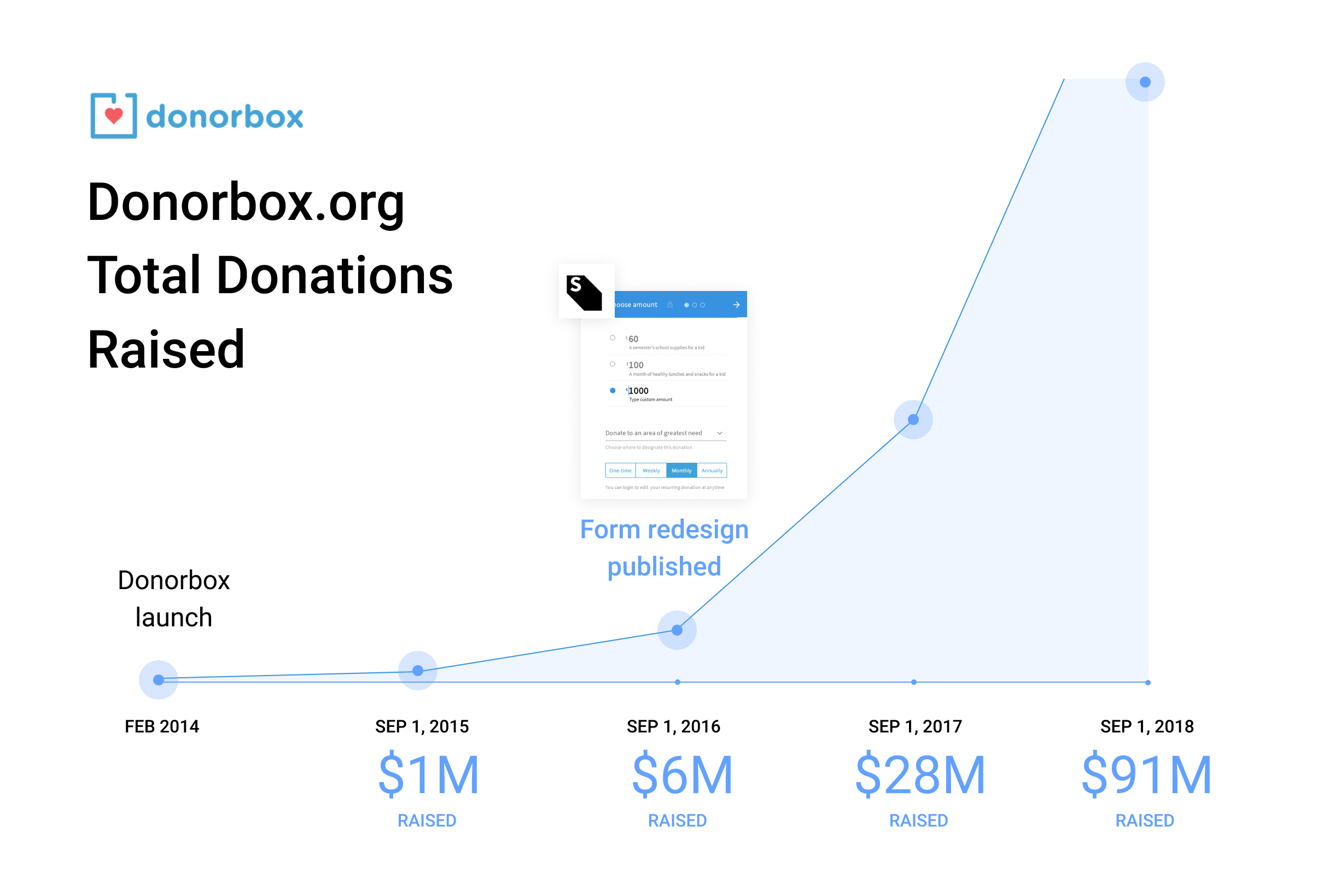
The result in conversion numbers
Donorbox grew to be the leading donation form for nonprofits to maximize efforts and collect more donations with the quick and painless checkout process.
The design made it possible for Donorbox to be easily customizable and to blend to every website perfectly.
Donorbox increased the number of donations in the following year after the redesign and gained many new customers.
Take a look at the Donorbox impressive statistics comparison for September 2016. vs. September 2017.
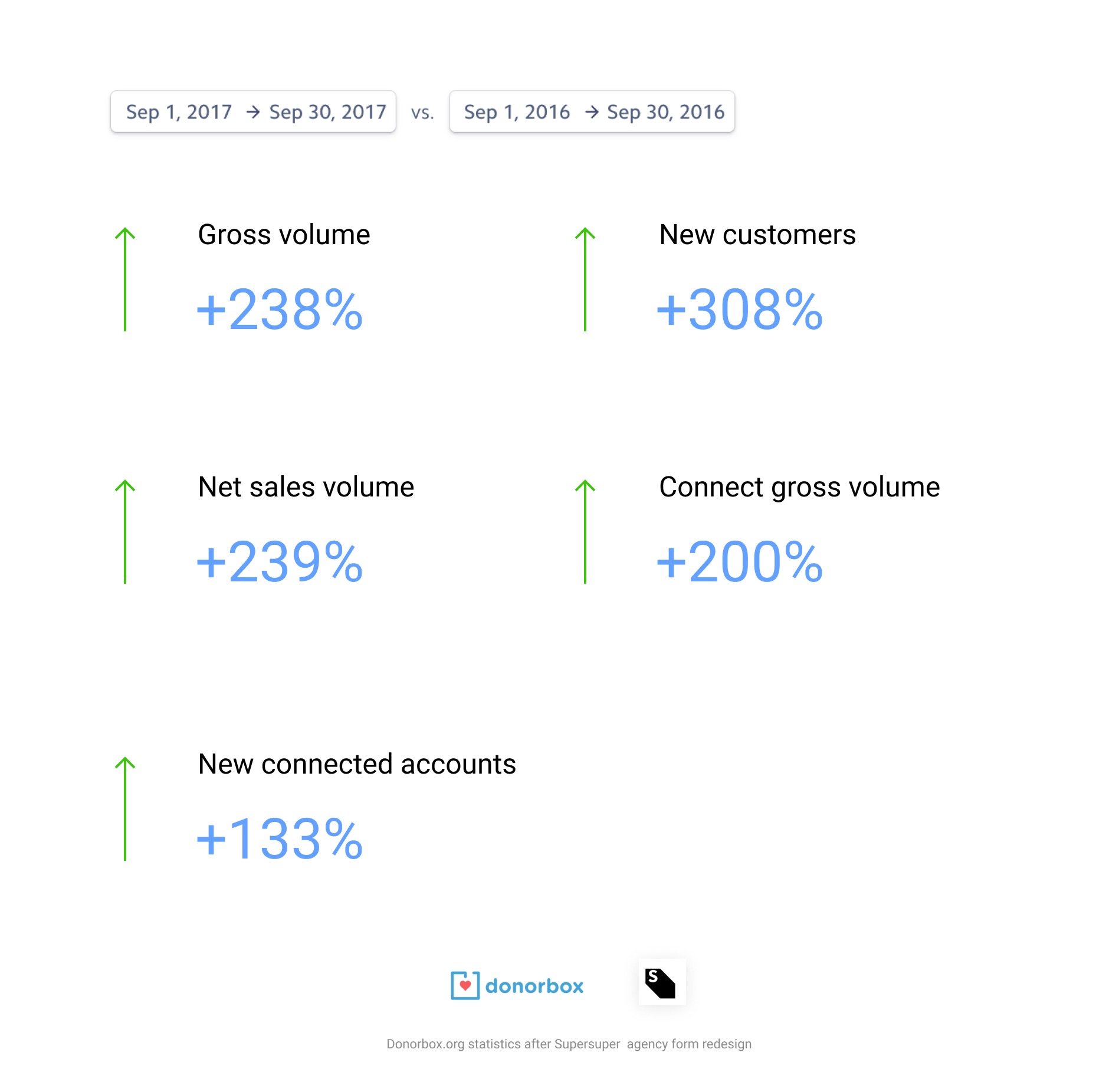
In total, in the months up to September 2018, the form processed $91 Milion!
Of course, the success of the Donorbox cannot be associated with design only; The Donorbox team did an outstanding job in terms of SEO, development, marketing, and other fields.
Our point is that UX's investment pays off for sure; the average increase is 30% up to 300%.
In fact, recent research made by Forrester.com shows that improved UX/UI can enhance customer conversion rates by 400%.
Please check the current Donorbox donation platform.
If you want to know more
We also made a fascinating talk with Donorbox.org founder Charles Zhang. Please look at the second part of the interview on how he achieved such outstanding results without seed investment funding! - Only bootstrapped.
And - if you want to check out a live version or start a donation campaign:
Check out Donorbox donation form here