Download Report Now
We will send a download link to your email address
Oops! Something went wrong while submitting the form
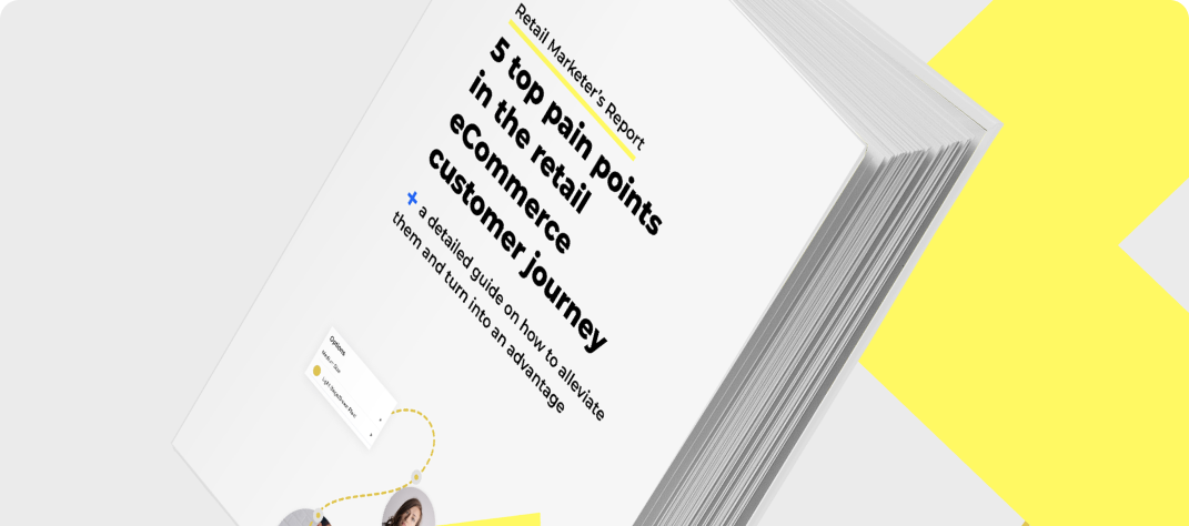
5 top pain points in the retail eCommerce customer journey
Plus a detailed guide on how to alleviate them and turn into an advantage
Free PDF Report DownloadSee More Details FirstReal Estate Management Platform Design for NYC Startup
Date: 2019
Client: NYC based company - Yinc
With the rising population in big cities, demand for handyman and vendors increased. But in today's environment of a massive amount of information, it is hard to filter out the good ones when choosing vendors.
The goal of Yinc was to create a platform with an enhanced user experience and a visually familiar, intuitive interface that would build trust and ease of use for its audience.
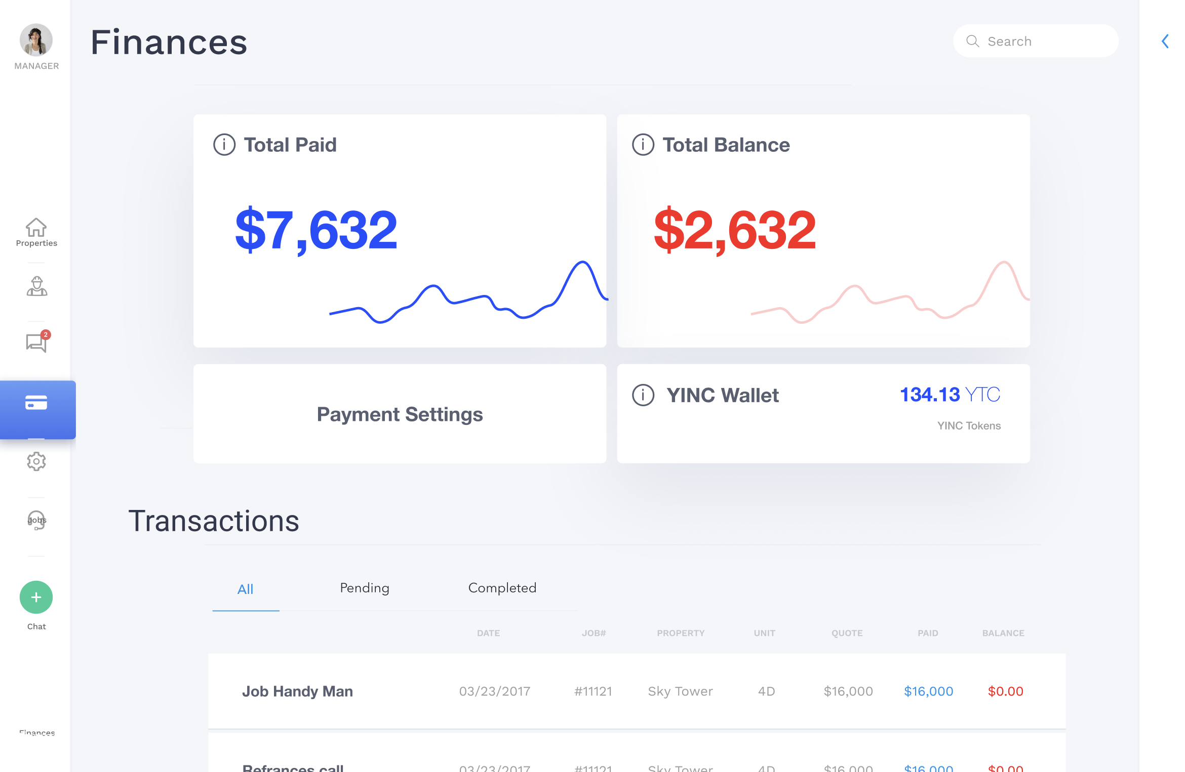
As part of the ecosystem, Yinc integrated its crypto-based payment token, the Yinc Token, enabling users to make secure, seamless payments within the platform while ensuring transparency and confidence in every transaction.
I worked on user experience and user interface design on the platform. Through research, UX, and UI solutions, we created a platform that feels familiar and meets the needs of users.
What I did
- UX research
- UX UI design
- Web dashboard platform design
The process
The whole team with the PM, researcher and UX designer collected all information and data from our clients to see their experience with the target audience in the niche. We wanted to gather as much information as possible before we start our research to define goals better.
After collecting all the necessary data and analysis, we defined a priority list of goals we need to meet. Based on the priority list, we created our roadmap, and we moved to the research phase.
We conducted the research phase from in-depth interviews and surveys from which we got insights into the biggest challenges for users.
We started creating UX design concepts through wireframes and prototypes. During the process, we kept the client updated with meetings every few days and wanted to get their feedback on solutions.
We found it very important for the client to be part of the design process because they could provide us with their experience from the niche and adapt our solutions.
This approach improved the user journey and we had a closer understanding of the whole process through the platform.
When we have successfully defined the UX design and got approval from the client, we moved ahead on the visual design phase.
The client wanted to keep the feel of their current visual style, so we had to make sure visual identity stays familiar but improved and adapted to new changes. The platform screens had a lot of information presented at once and it was essential to declutter screens to improve usability.
We provided the client with designs, and based on their feedback, we made additional refinements to ensure both users and the client will be satisfied with the final results.
Design Challenges
There were many challenges I came across during our process. Some were easy to fix, but others were more demanding.
Research
From research, I were able to see key points and main challenges users came across.
The main pain points for users were :
- signing up page and knowing in which category the user is,
- creating properties or job ads and
- using in-app communication between teams, vendors, and managers.
Solutions:
- create separated signup forms for all three account types and simplifying steps in the signup process
- reducing property or job creation process in smaller steps
- getting users to focus on filling out a few information at a time, instead of all data at once
- decluttering in-app chat and creating quick links between chat and jobs
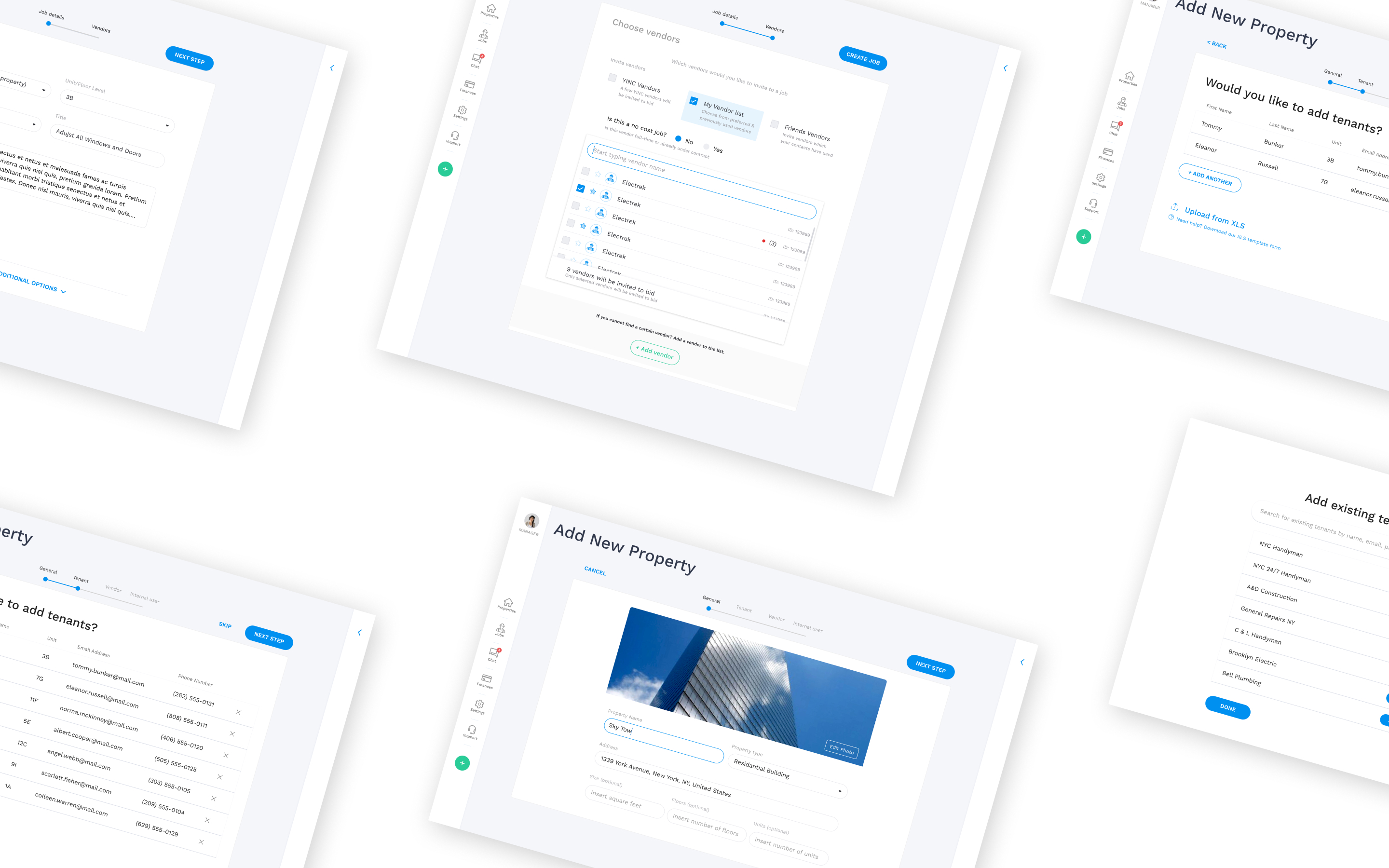
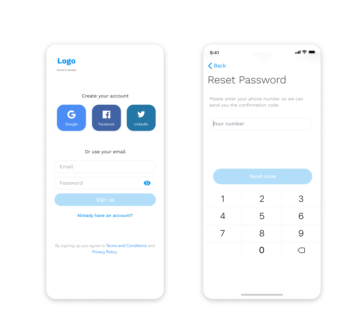
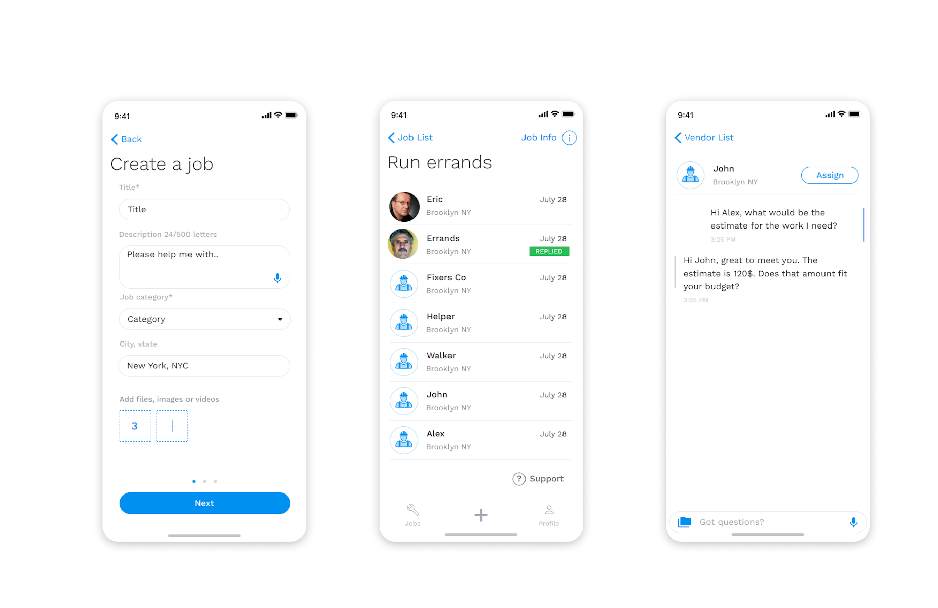
1. Creating an account
Account creation seemed to be the first obstacle in the user journey because users in the initial version didn't know what type of account they need and gave the impression it is required to have a business to register.
Managers had a hard time knowing what is next and how many steps remain until completion of sign up.
Vendors confused profiles and often ending up registering manager profiles and it required assistance from the support team.
Challenges:
- creating a clear account creation process
- getting users to register for the right account type
- users can create an account without additional assistance
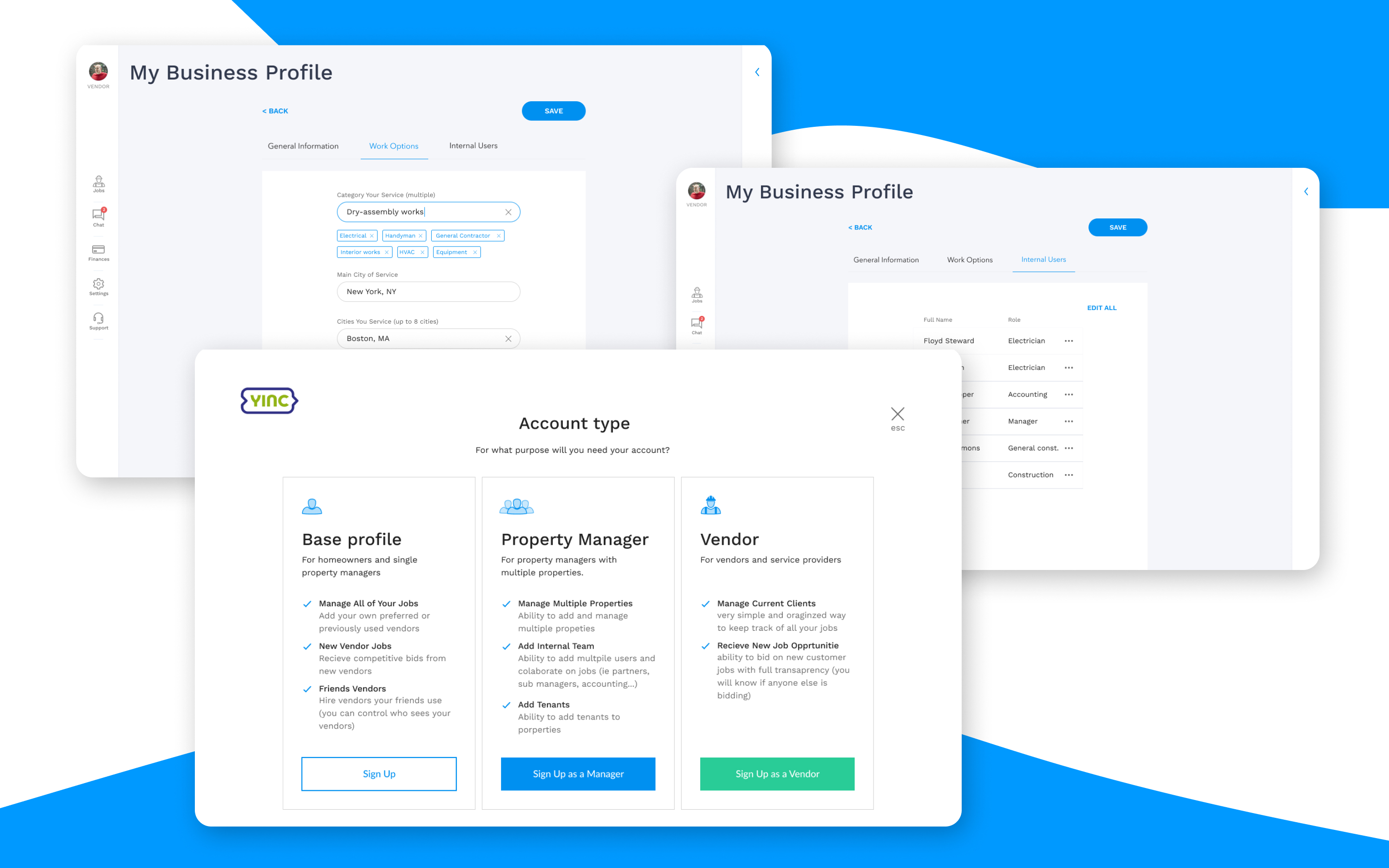
To avoid confusion with account signup, we have internally tested several possible solutions. Each had some downfalls, but with refinement, we managed to produce a solution that offered each account type to have their signup form at the start. The signup form had features listed below for each account accompanied by an explanation of each element.
Explained features helped users to determine which profile type they need.
In the registering process, we included a progress bar to let users know how many steps remained during the whole process. Having a progress bar made users less anxious during the signup and more finished registering.
Solutions
- each account type has their signup form
- users choose account type first, and then they go to filling out data
- account types have a list of features for each account
- implement progress bar for the signup process
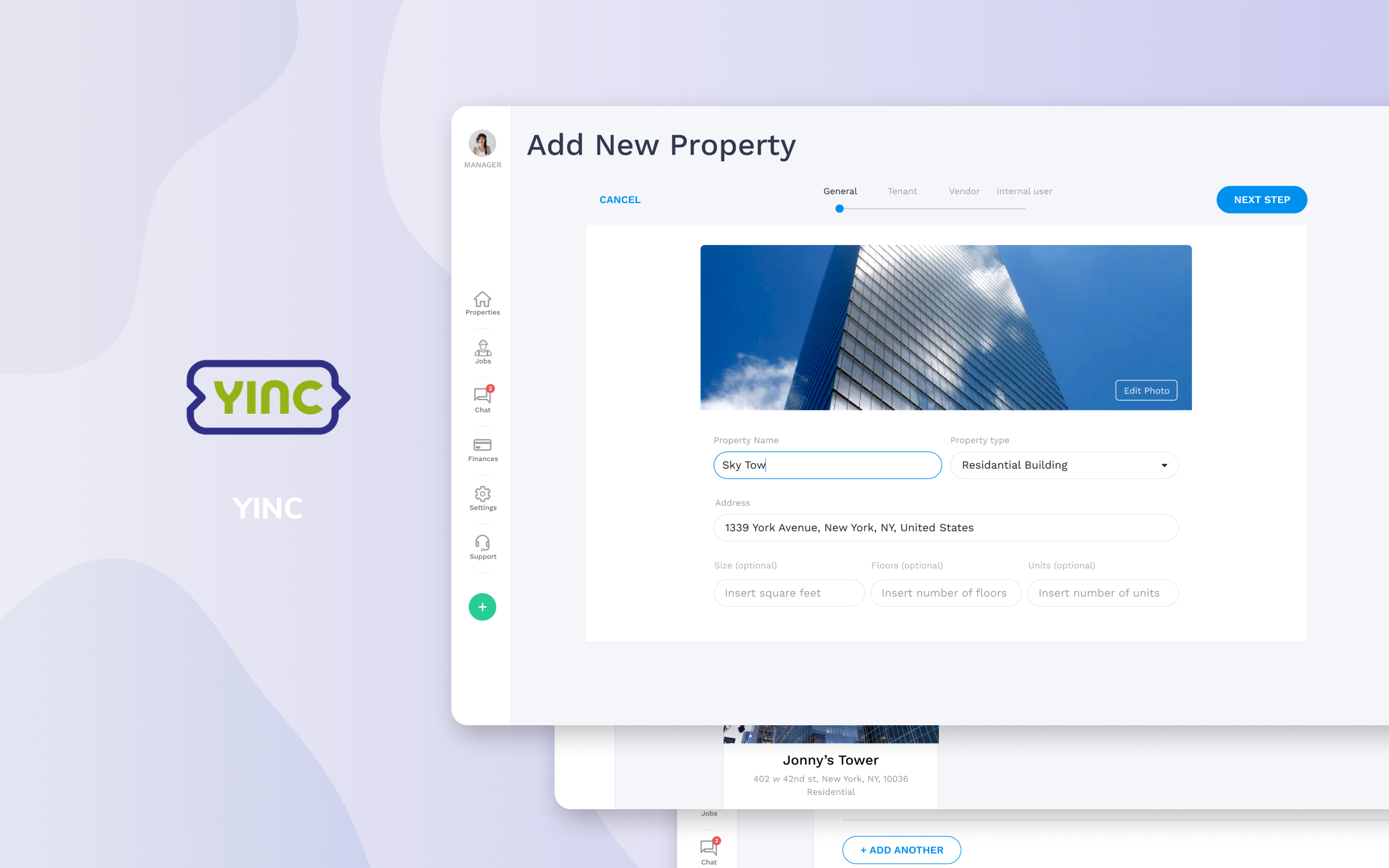
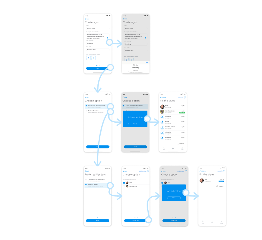
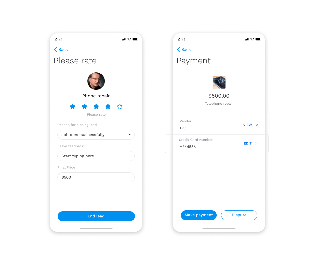
2. Job and property creation process
The original design contained property and job creation form, but our research proved to be too complicated for users. Users needed to make a lot of decisions at once and they were anxious to click around because of fear of losing all data they've input into forms. It was clear to us this was a significant step and we needed to give it a lot of thought.
The biggest hurdle for users was losing all input data. Users weren't able to prepare for the next step either, because they didn't know what information they will need for the next step.
Users who were managing small properties didn't have a big issue with this step, but users who manage multiple properties and jobs did. At times users got lost in the process or forgot for which property they are adding or changing data.
Challenges:
- not knowing what will happen and if users will lose their data if they click on a button
- too much information to put at once on one screen
- letting users know where they are in the process and when the job listing or property is active
- users were overwhelmed and occasionally had trouble remembering at what step and property/job they are on
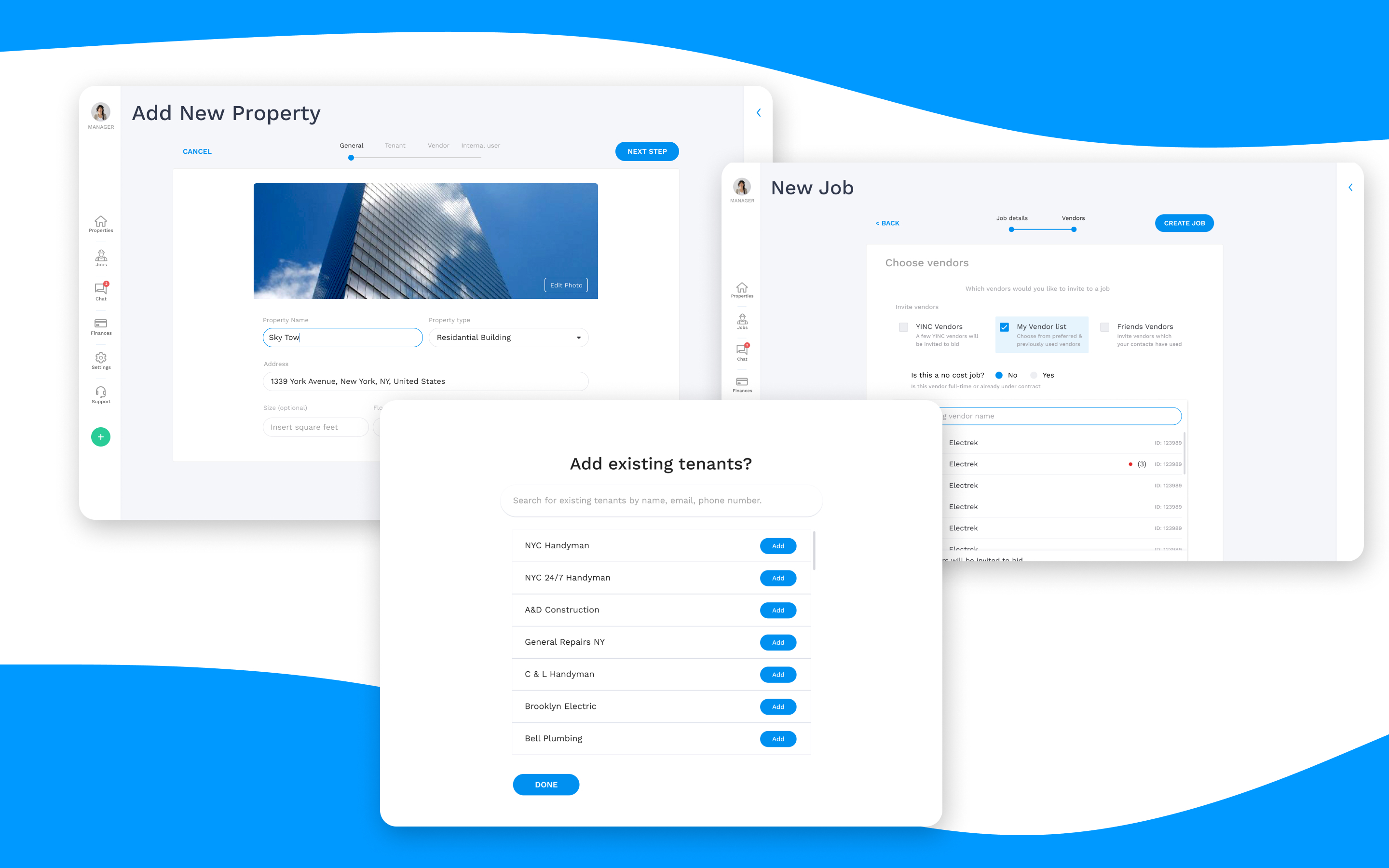
We immediately tested several solutions and few showed potential. We made two different solutions and had it tested. One of those solutions showed progress with both users and the client. With the client, we separated the process into steps and simplified the property/job creation process.
We focused on asking users to provide us with one information at the time, thus relieving users of anxiety and information overload. This solution was great for users as it also provided them with a progress bar and could prepare for the next step.
Managing information became more manageable for users and more users finished creating a job and property process.
Solutions:
- reducing form size and separating the process into smaller steps
- introducing a progress bar
- letting users know what the next step is and what each button does
- getting users to focus on one thing at the time to reduce anxiety
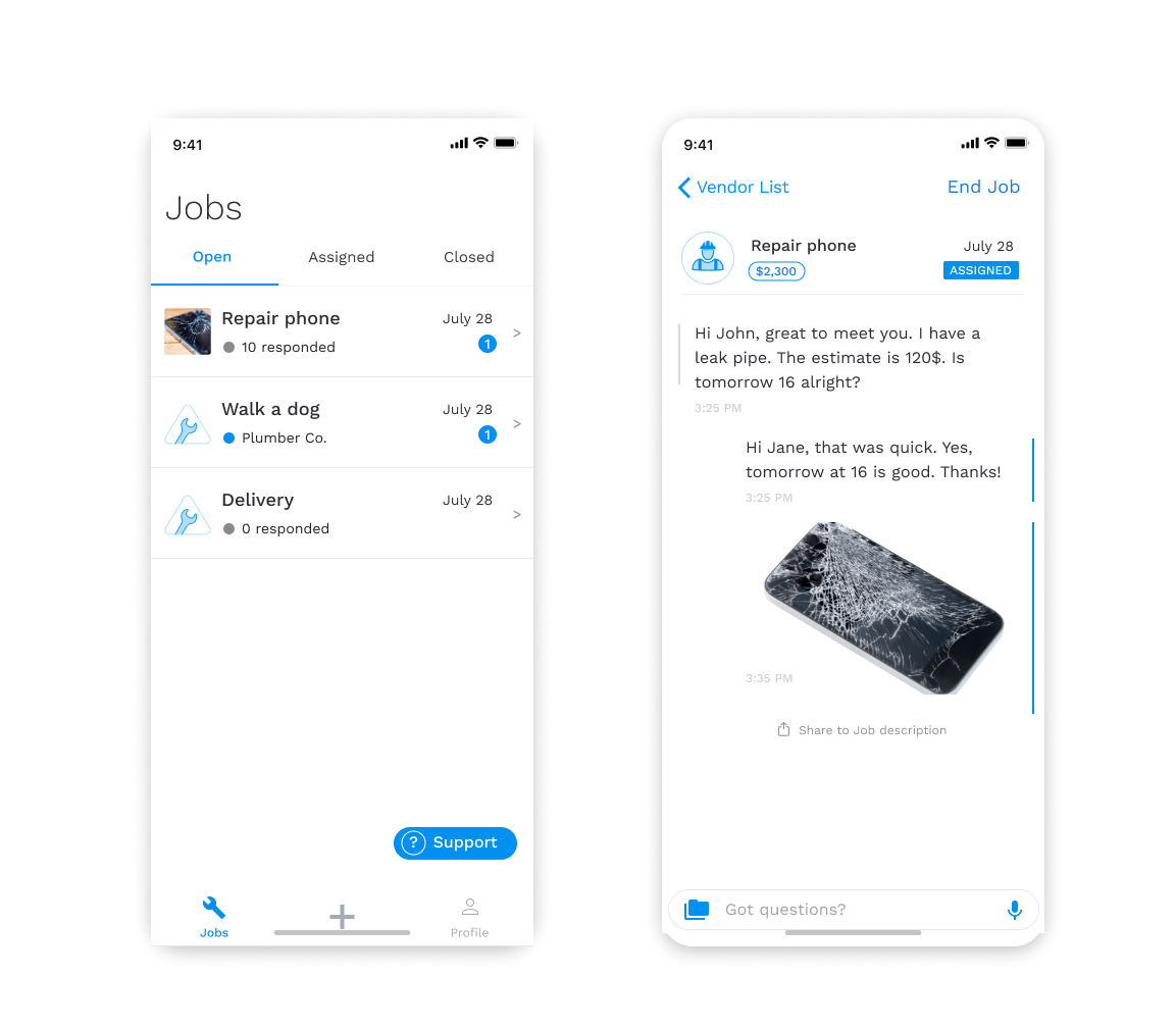
3. In-app communication
In-app communication was another thing users fond very important within the platform. Once they posted a job, there were some follow-up questions from vendors and users for one another. Chat also enables users and vendors to negotiate and explain the cost of a job or modify the scope of work.
Existing chat was cluttered and getting to the right conversation was a challenge. It was essential to make this step intuitive and give managers and vendors a clear overview of their chats.
Challenges:
- how to declutter chat screens
- give vendors and managers easy access to relevant chats to job
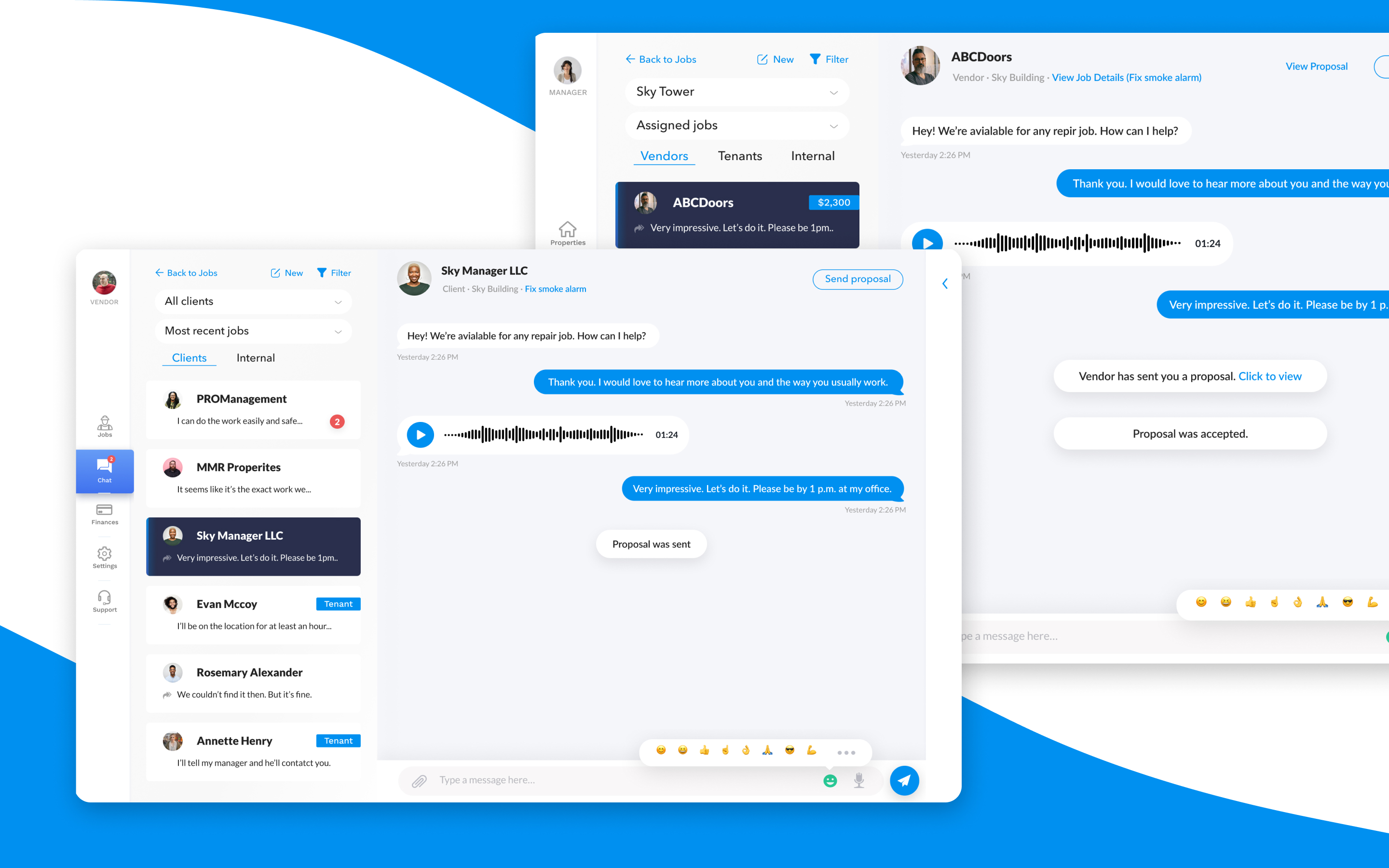
The previous design of the chat was too cluttered, but it had a good foundation. We decided to modify it and build on top of it. We had three ideas on which we consulted with our client and decided to go forward with the one that could be used universally for all account types, thus keeping development costs minimum.
Chats were grouped according to job listings and added filters for easier searching and sorting of offers. We kept an internal team, vendor, and tenants chat separately. This way, users could immediately determine who they are communicating with, without having all chats mixed up and losing track of jobs and conversations users had.
In chat, users could access jobs directly, and vice versa. This flow allowed users to jump quickly from and to job postings and save them a lot of time.
If users didn't use a particular feature, we removed it for their profile and kept chat interface decluttered and precise.
Solution:
- grouping relevant chats to specific jobs
- create a filtering option for chat
- keep internal team, vendors and tenant in separated groups
- create quick links between job postings and chats
- remove features user is not using (option in user's profile settings)
Mobile app
Results
We helped Yinc to create a property management and vendor bidding platform.
We delivered:
- user flows and interaction logics in one week
- working prototypes and testing in two weeks
- web application platform in four weeks
- user testing and user research
The app is in development process